Totelcom
Finding the balance between humor and advocacy

Overview
A brand update and new site bring a family business into a new era
Scope
Branding
UX/UI Design
Content Design
Collaborators
Carrie Grant, Designer
Travis Chillemi, Web Director
Mike Oslund, Brand Copywriter
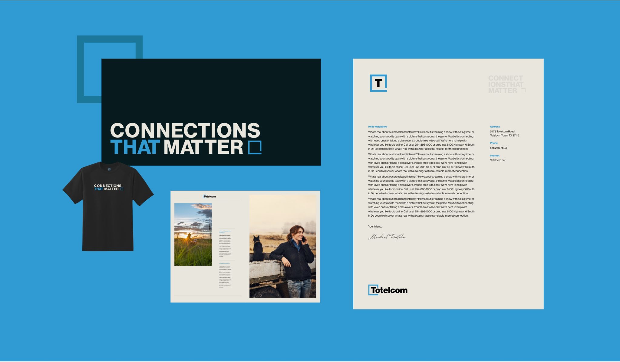
Connections that matter ·


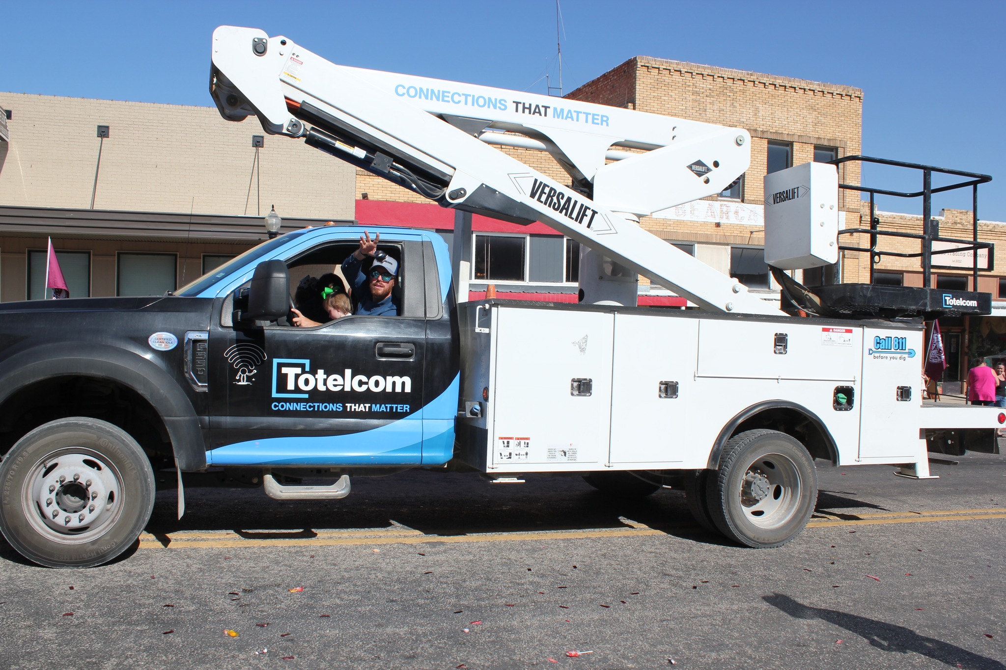
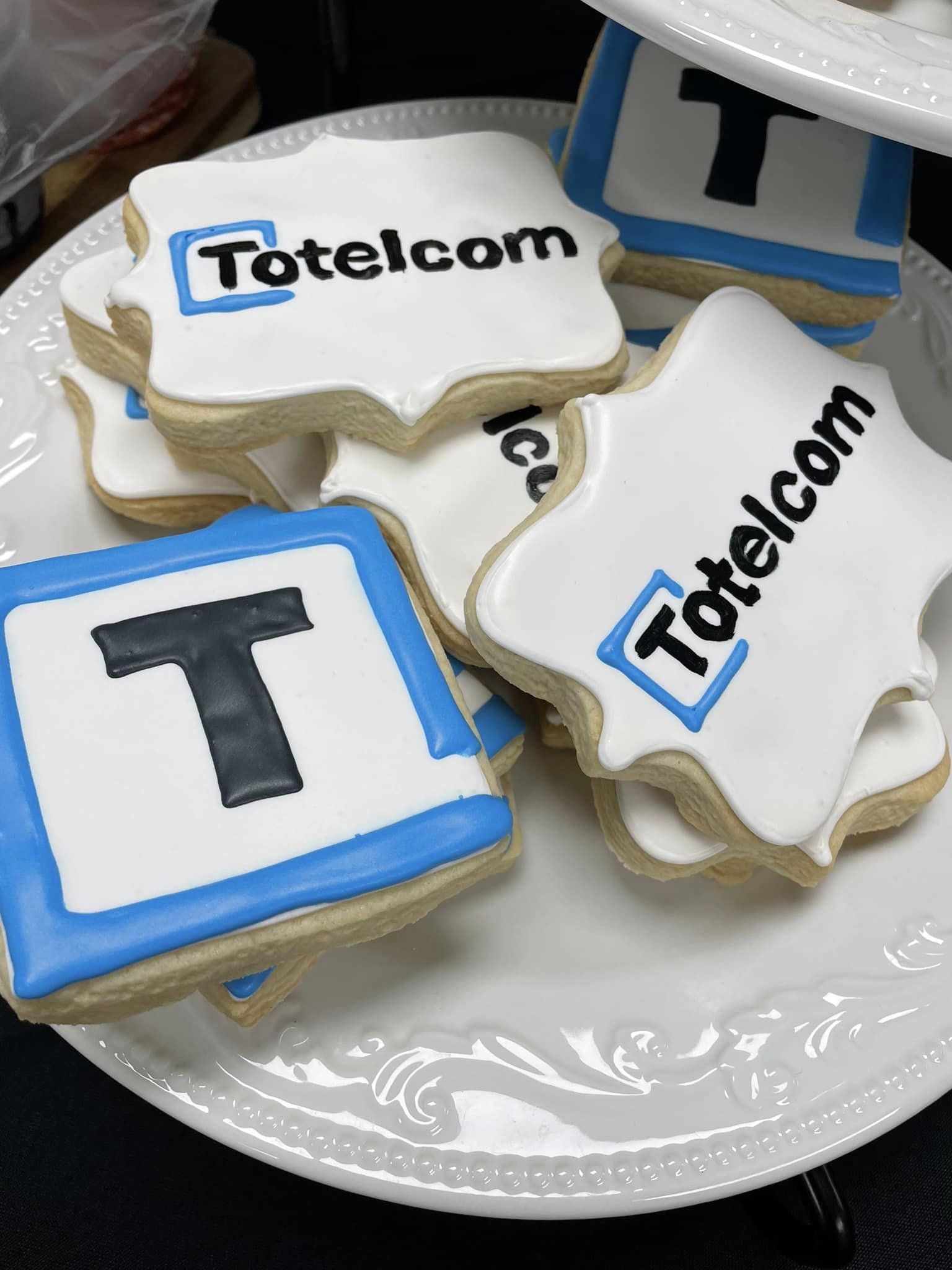
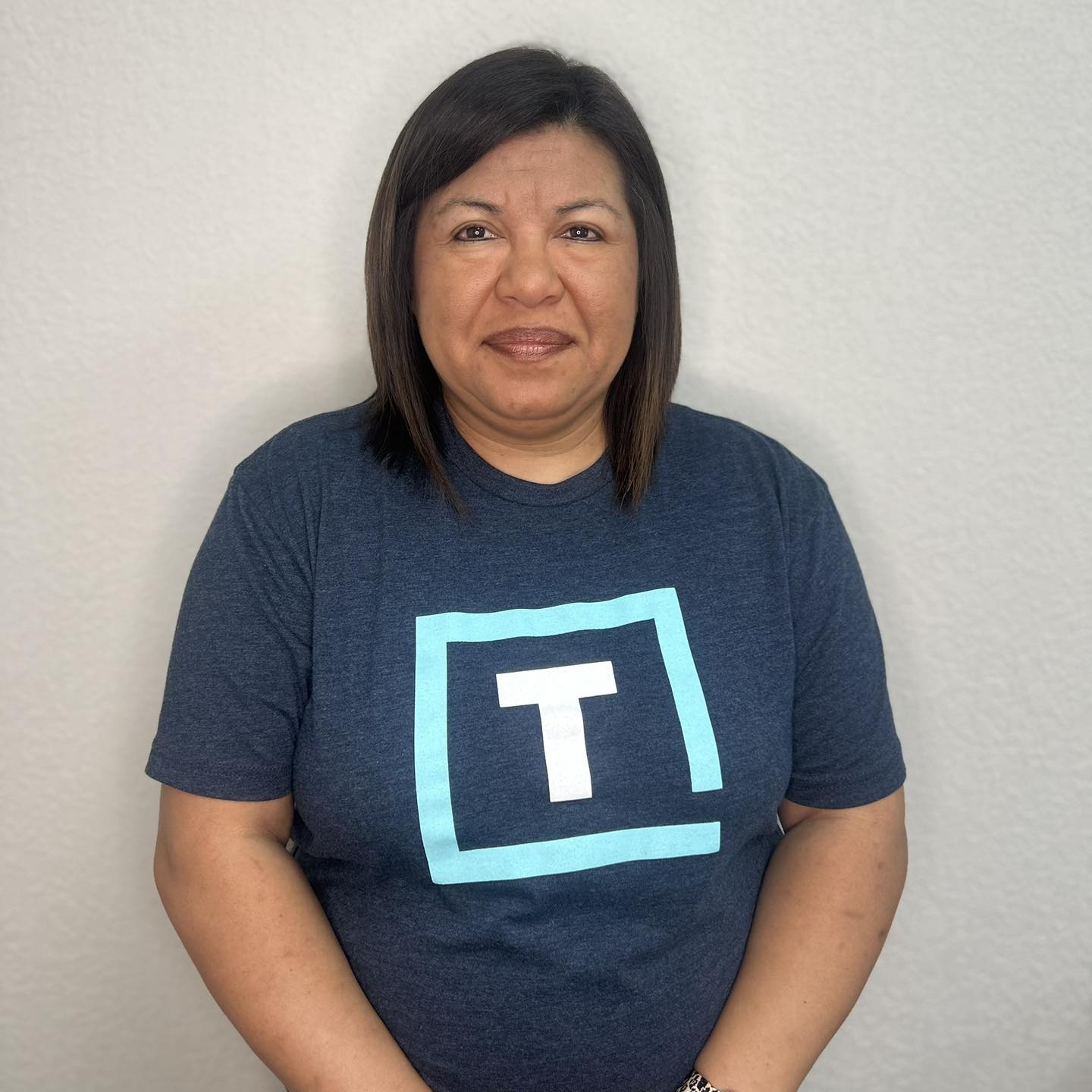
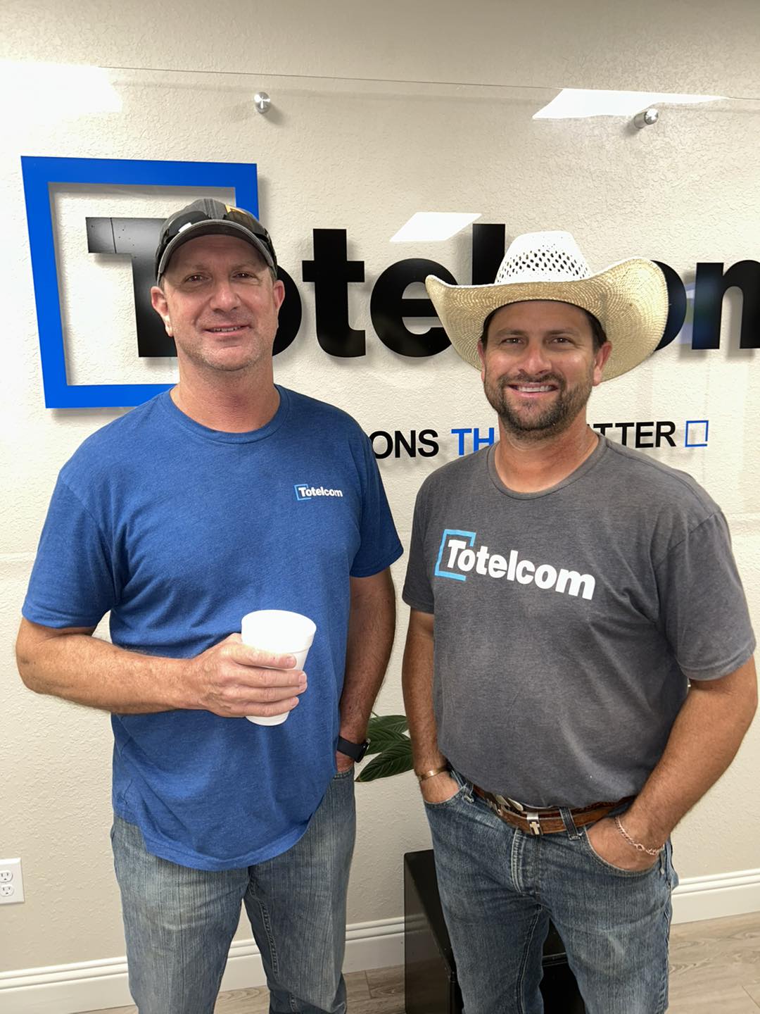
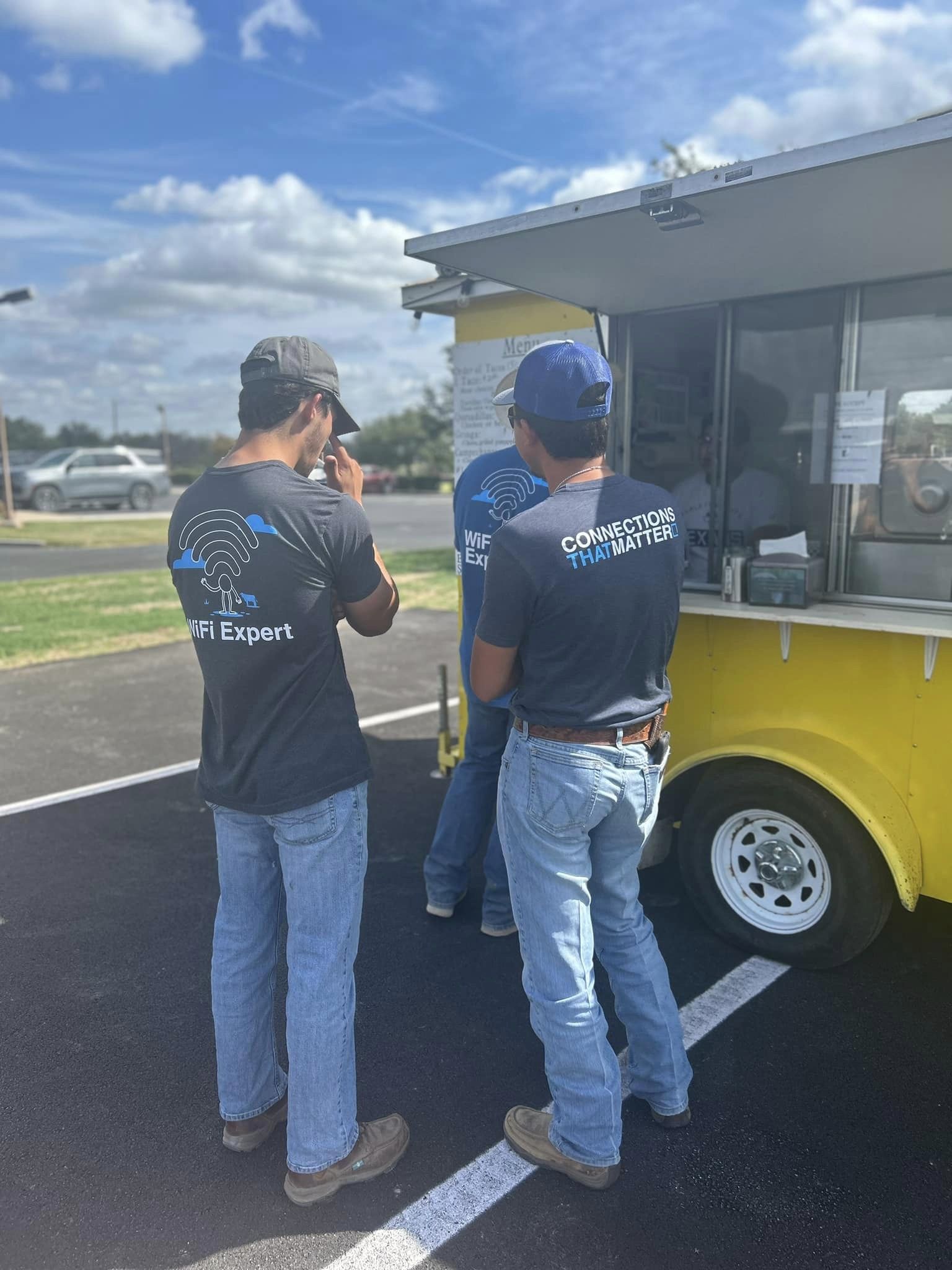

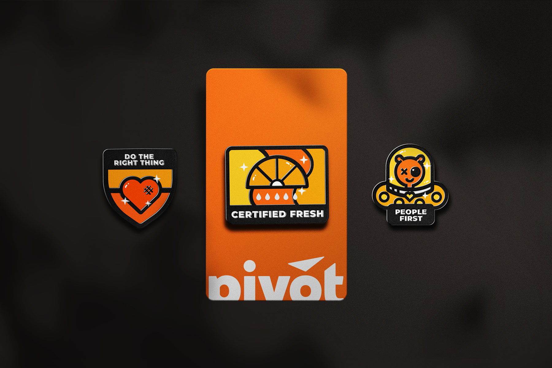
Simplify the brand
Totelcom’s project started with a full brand assessment and revision focused on building a modern, simple, flexible brand that could easily flex to meet both their marketing and governmental advocacy needs.
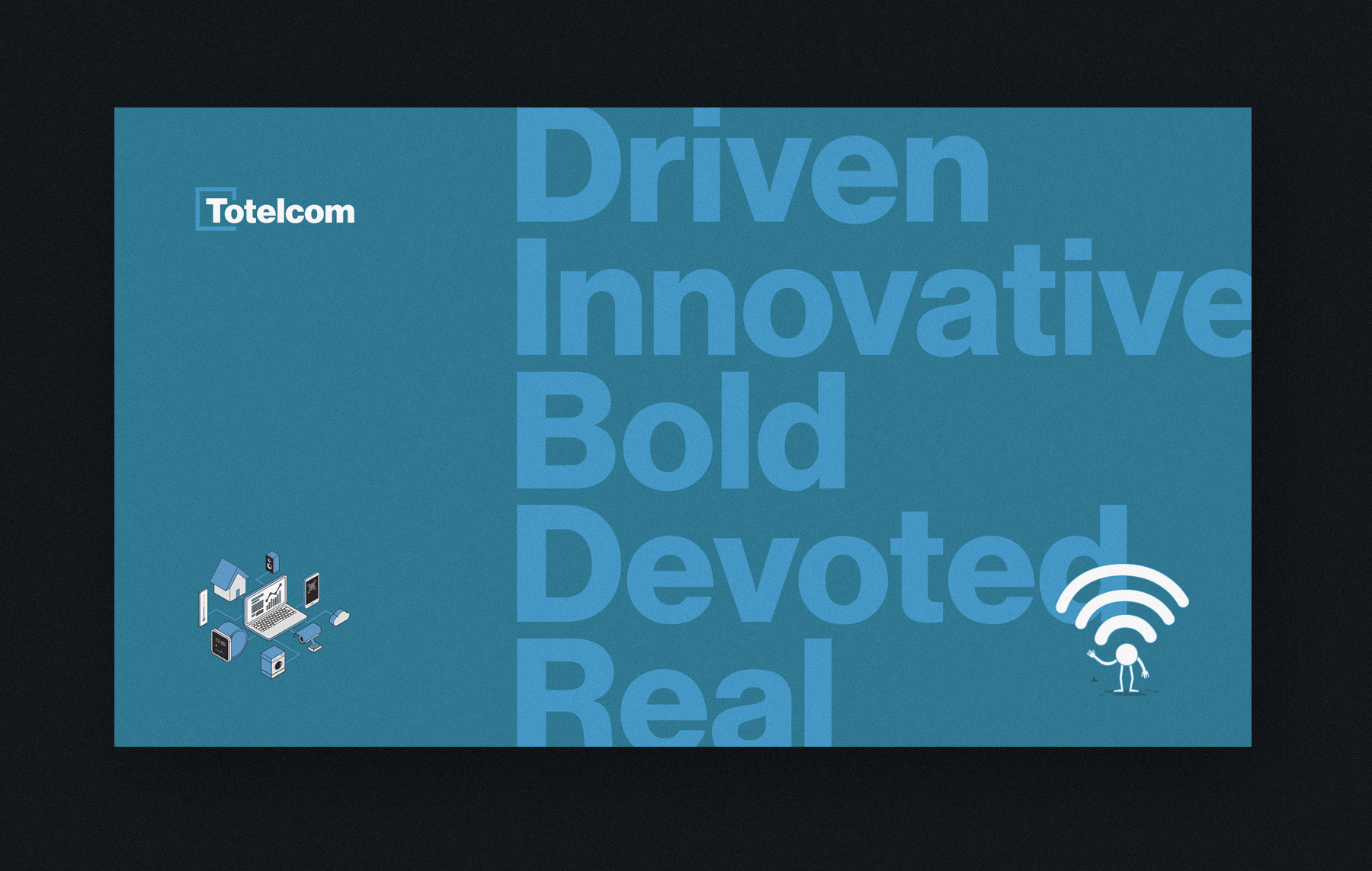


Finding balance
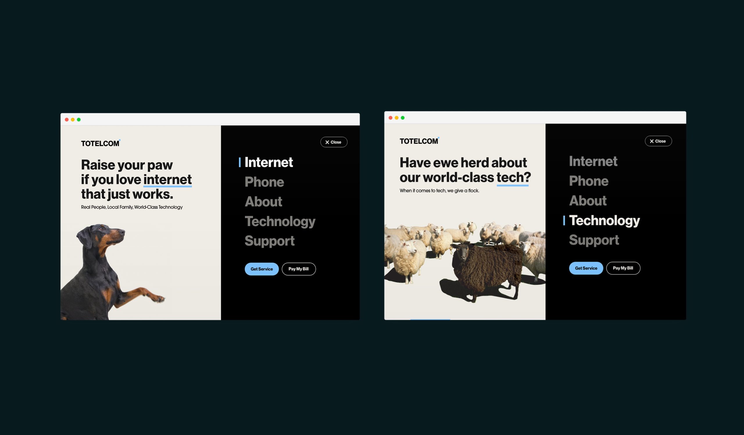
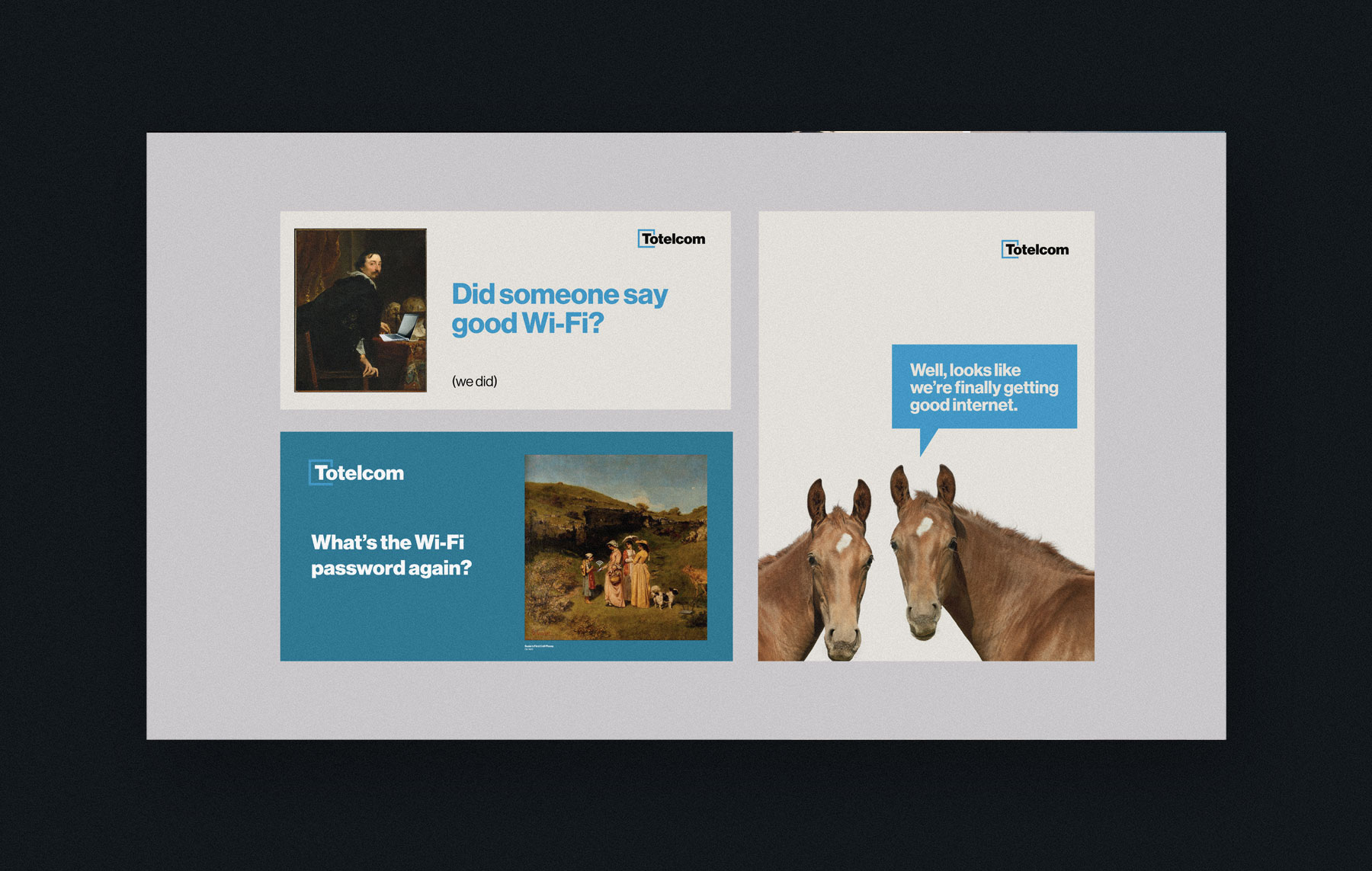
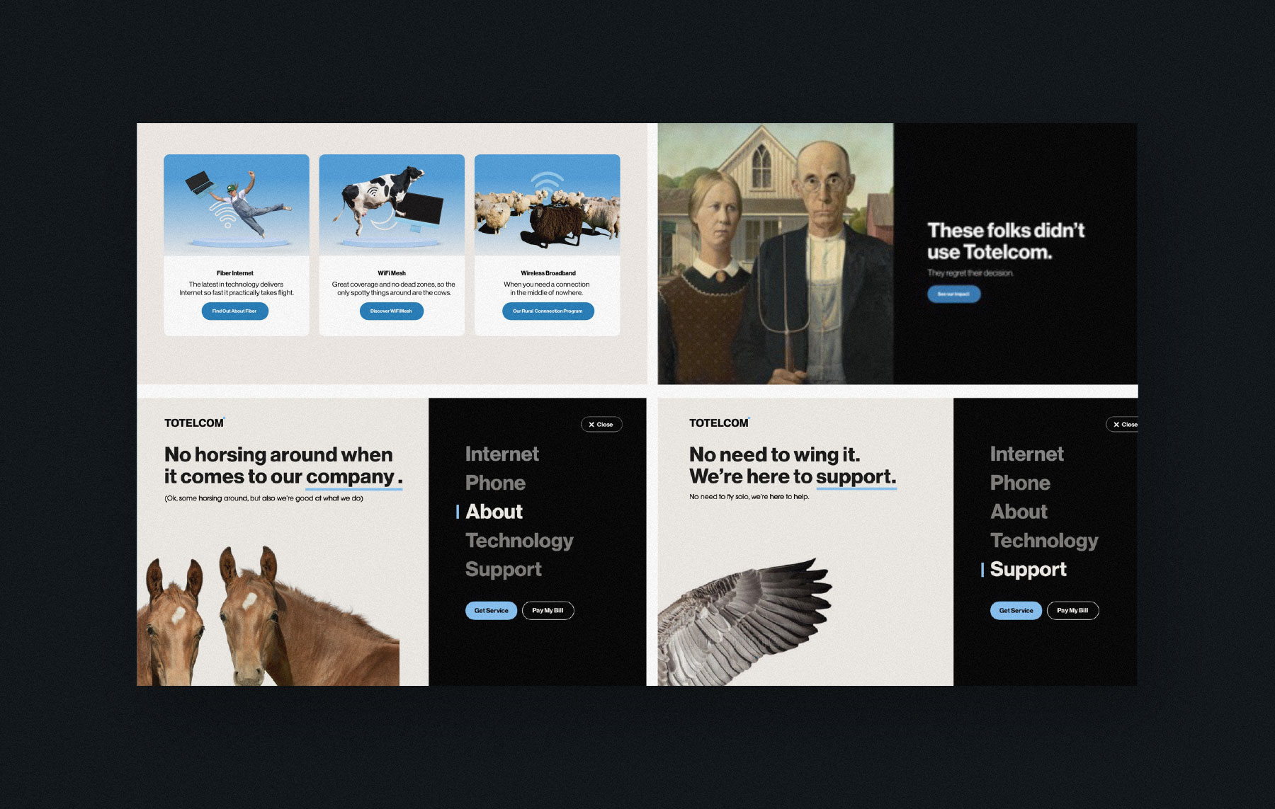
Streamlined and focused visual language was paired with new messages, defined values, and a clarified story. A key challenge was developing a visual language that balanced the brand’s liveliness and humor with the necessary seriousness for advocating their rural communities’ needs at the state congress.
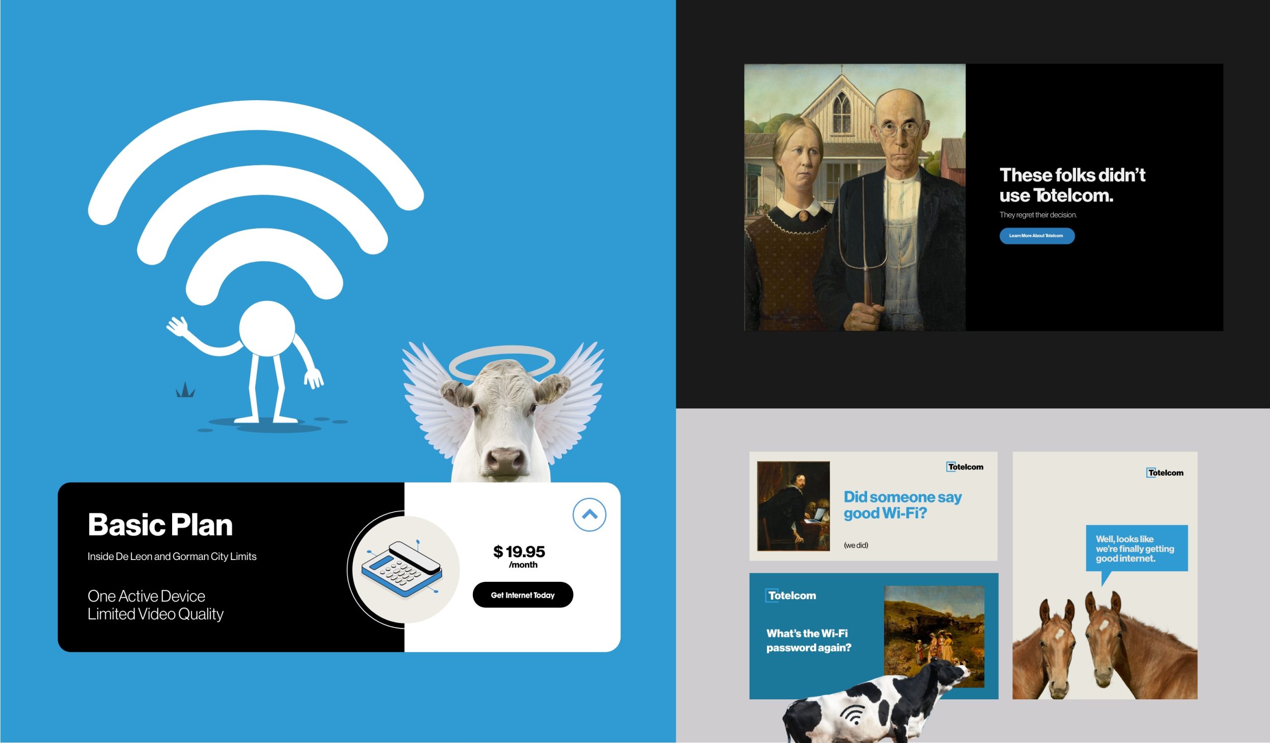
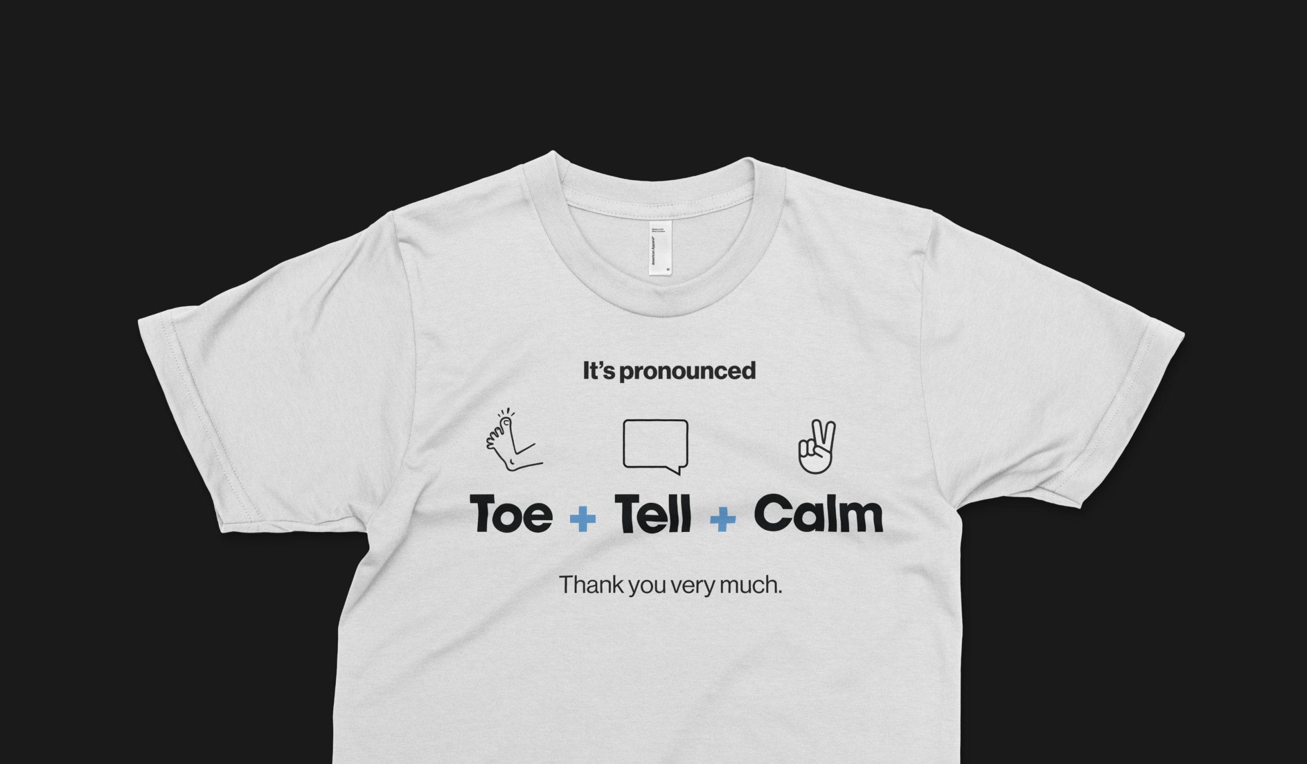
How do you say…
During our user research, we uncovered that many people mispronounced “Totelcom”. While that wasn’t part of our project scope, we couldn’t help but address it on the site.

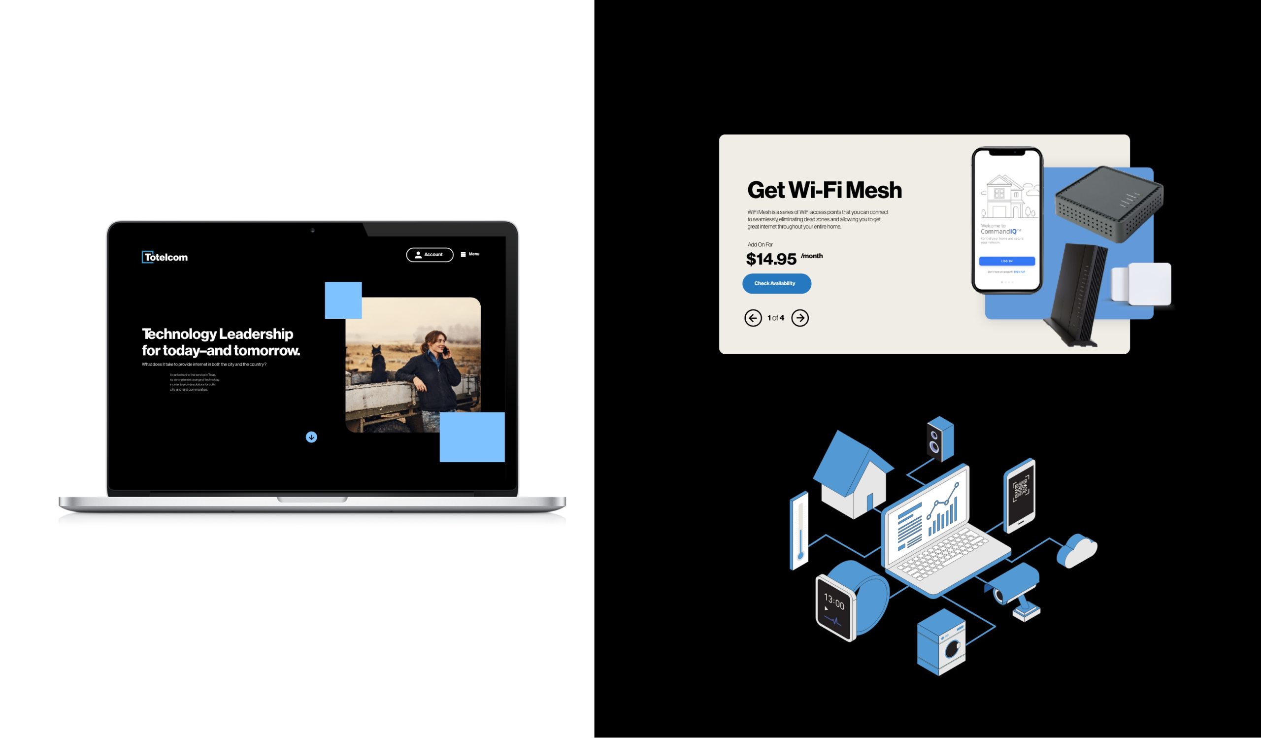
UX challenge
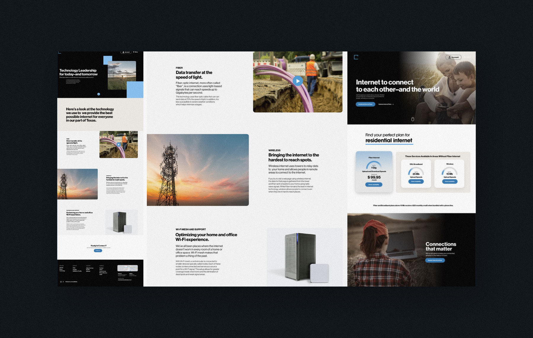
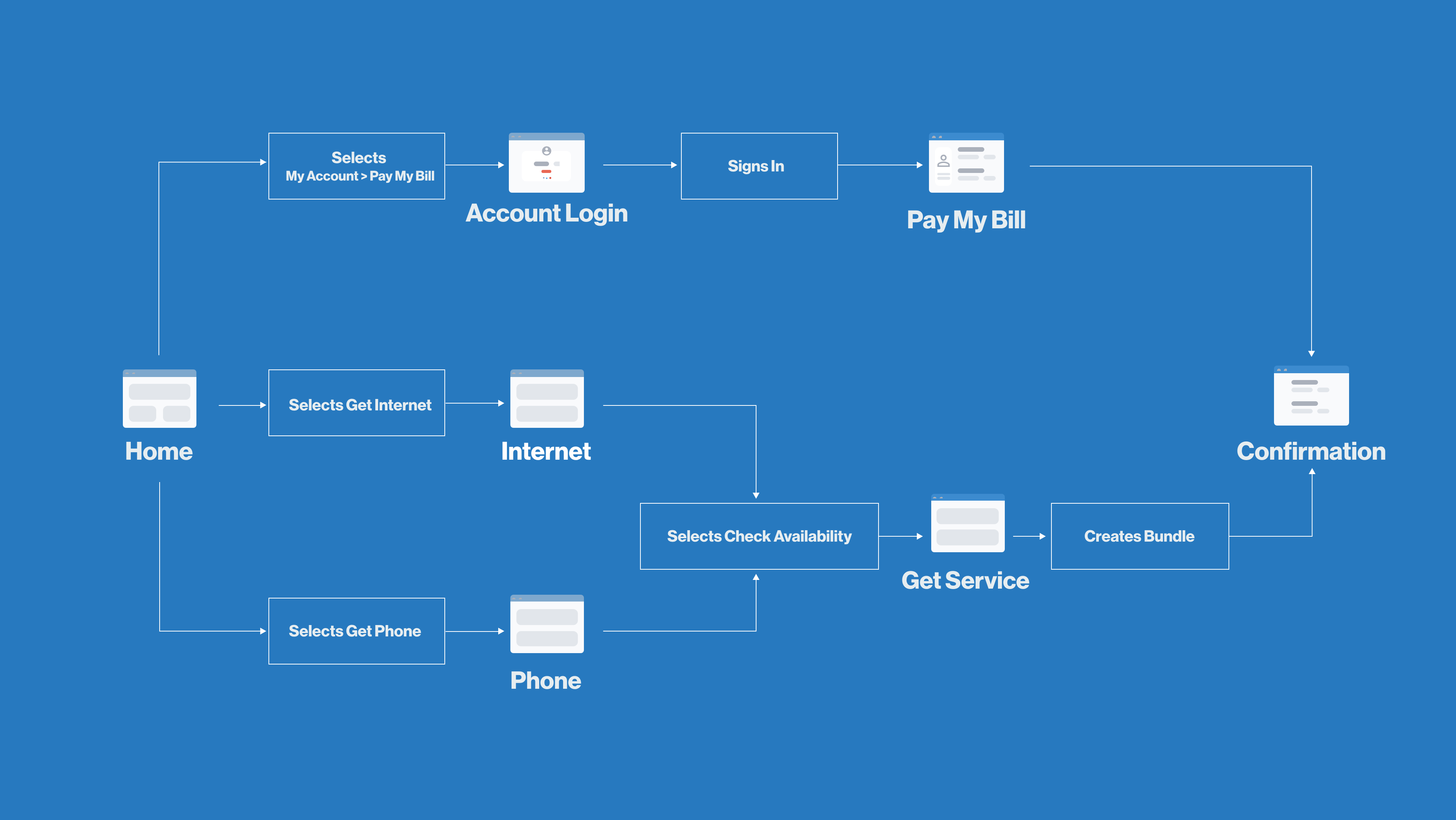
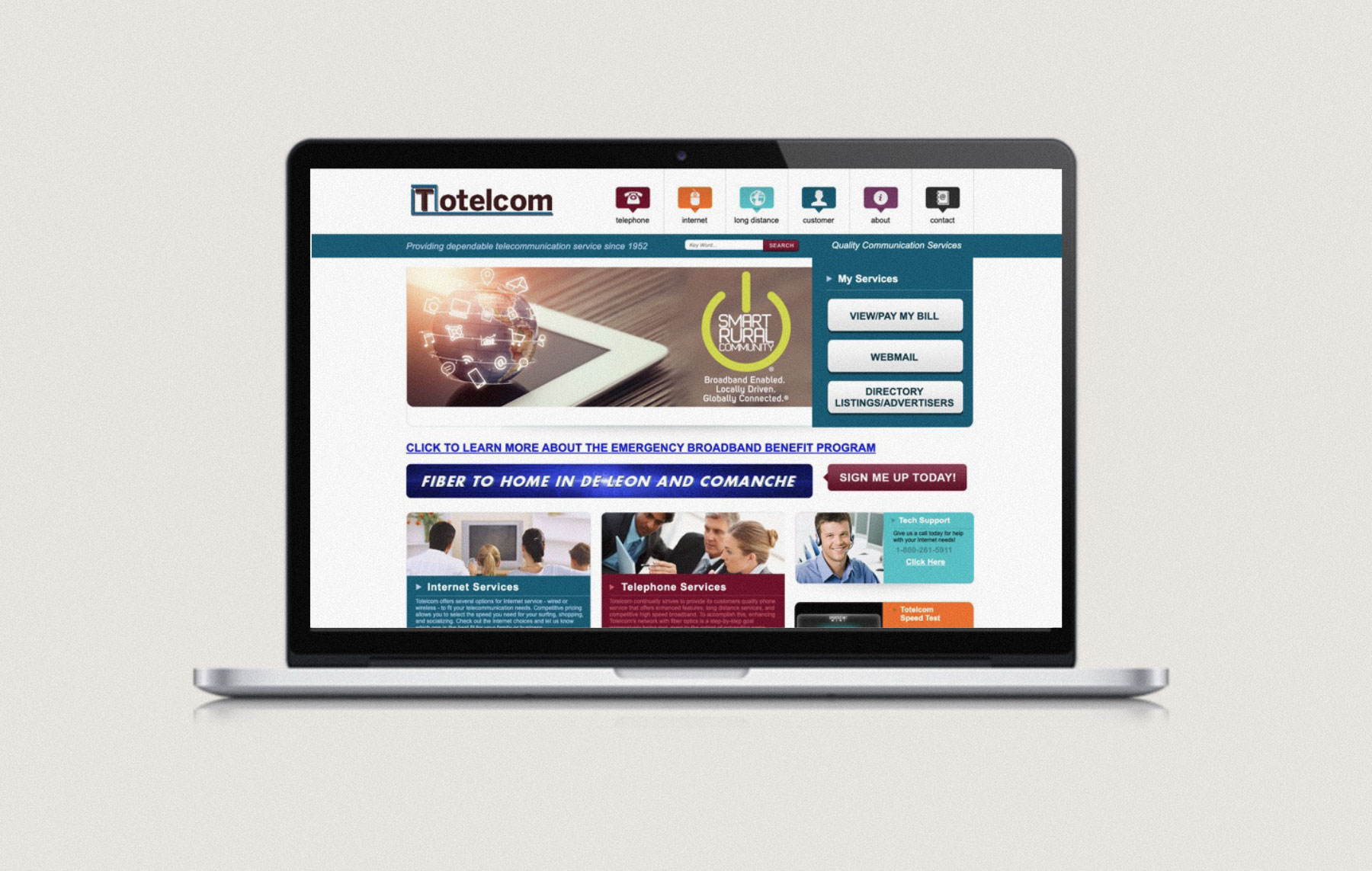
Totelcom’s original website suffered from content design challenges, where conflicting text and visuals created user confusion by lacking a clear direction or focal point. We crafted user stories and wire flows in order to streamline the site’s organization.
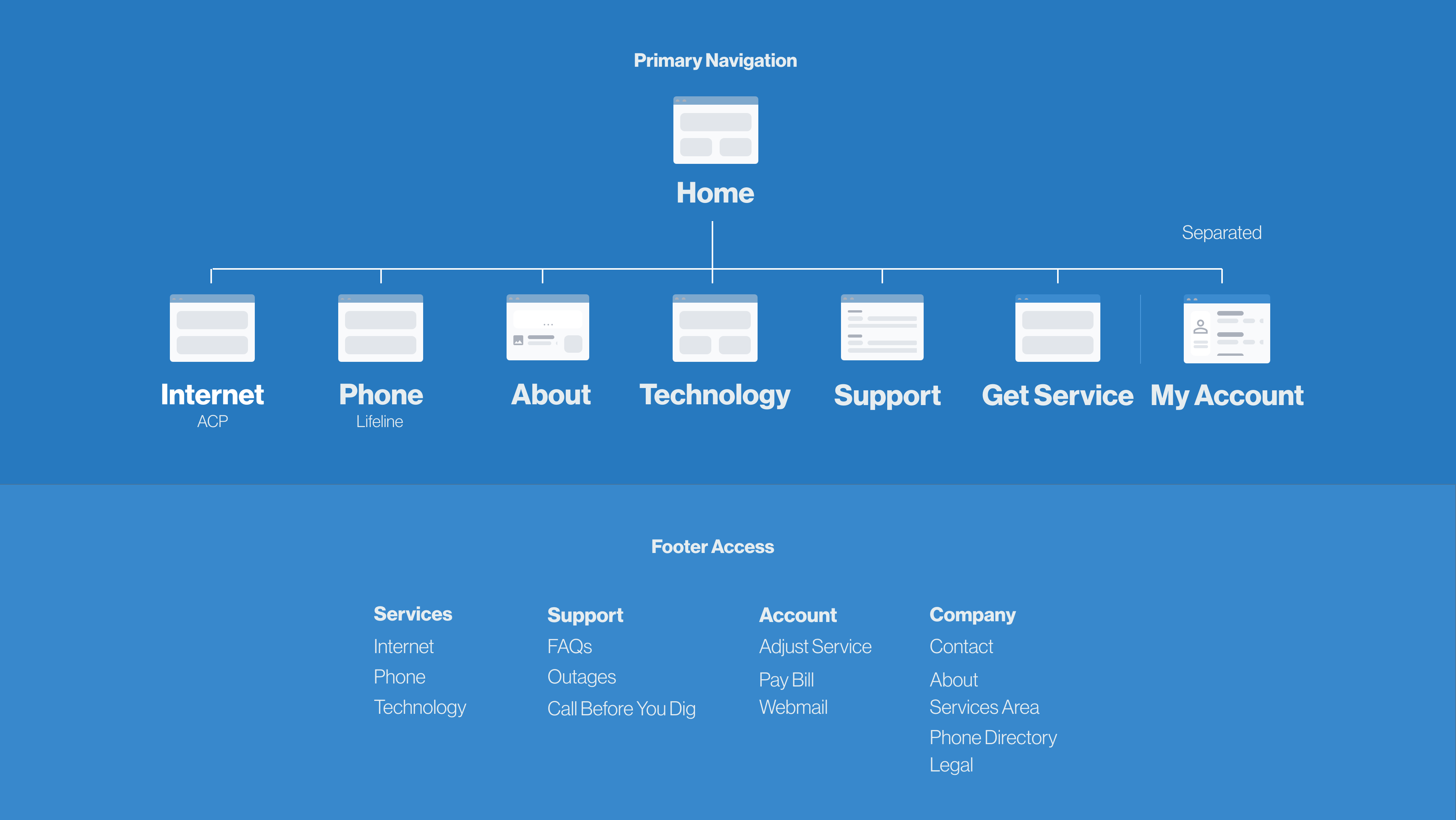

Clarity in design
Navigating a website should be an enjoyable experience. We used wireframes to define modular content structures that would allow the site to grow and change over time while still maintaining clarity. By seamlessly integrating playful brand elements with an easily-understandable menu and intuitive content structure, we made sure every visitor had a clear and delightful experience exploring their offerings.


Setting the tone
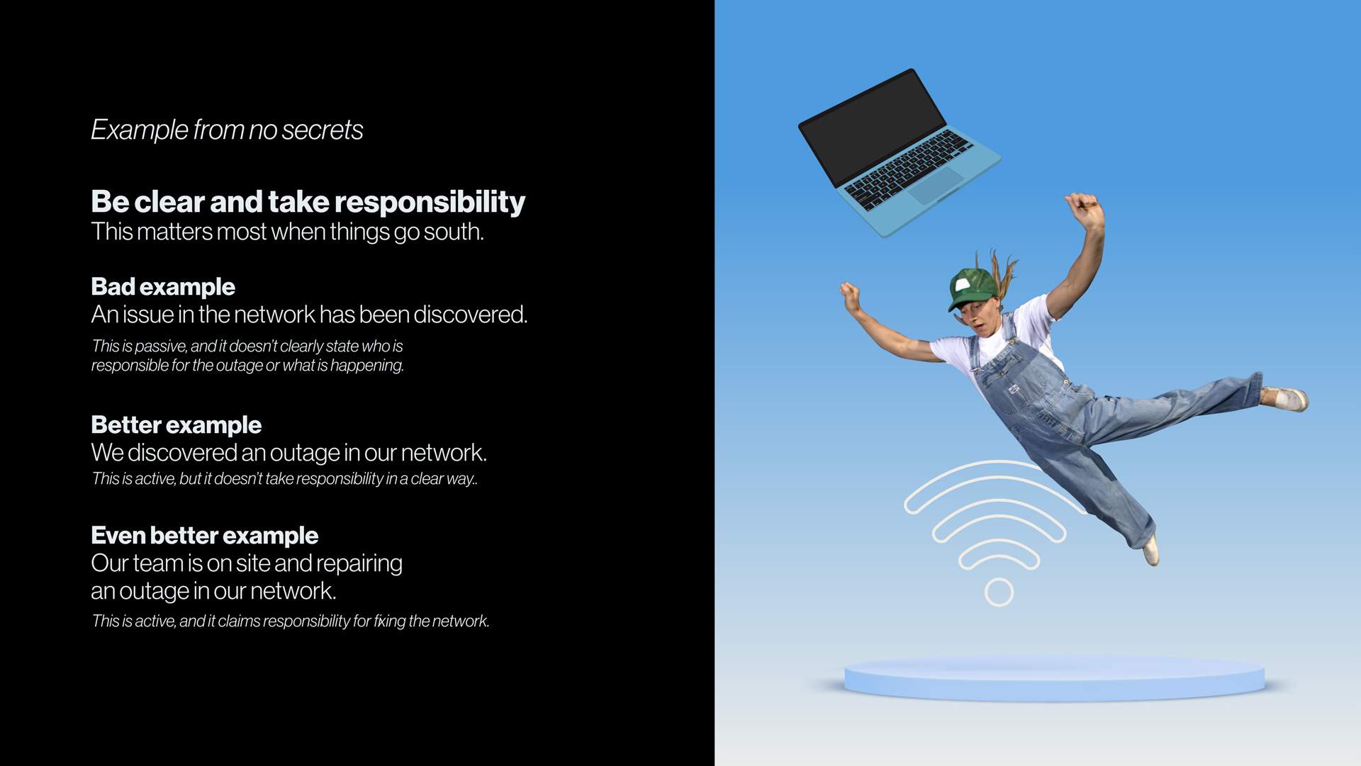
A UX tone guide applied the brand’s voice to the website and provided the team at Totelcom with support as they began creating content for the brand.


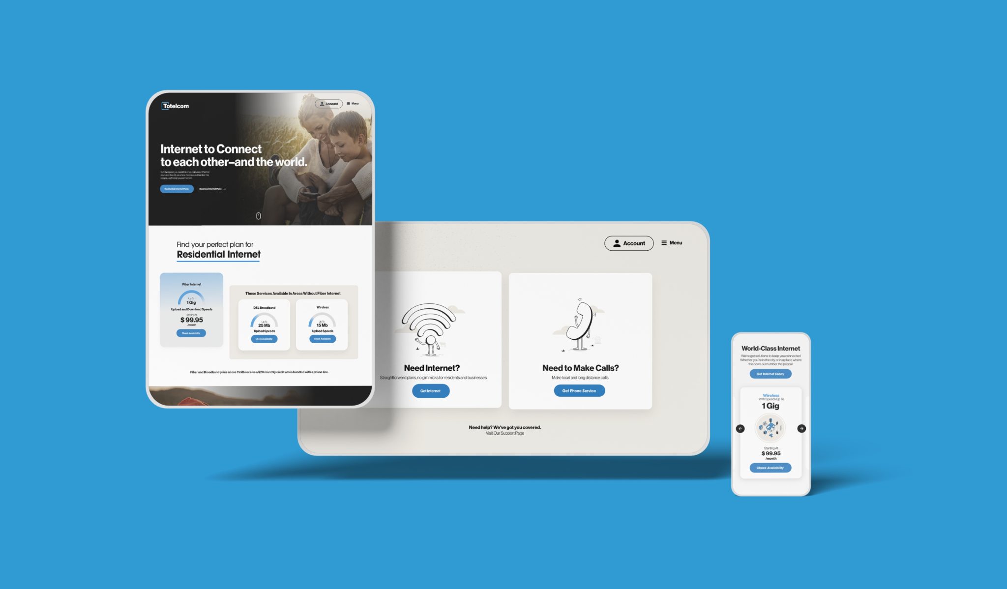
Paradox of choice
Based on user research, selecting an internet plan was one of the strongest points of friction for visitors. The simple move to highlight the service with the highest customer satisfaction rate greatly reduced the paradox of choice that visitors previously experienced.

Results
A perfect score 10/10
“They are very creative and very good at getting to what you want, even if you don’t quite know what you want.”
— Michael Prather, Vice President, Totelcom