UX Writing
Microcopy Moments
Overview
Bringing human language to digital moments.
the right information · the right time · the right way ·
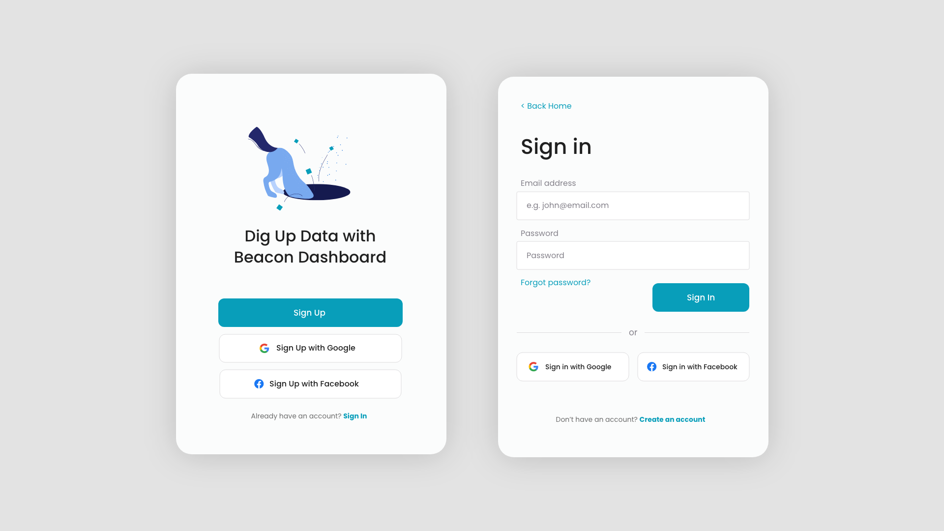
Clear options
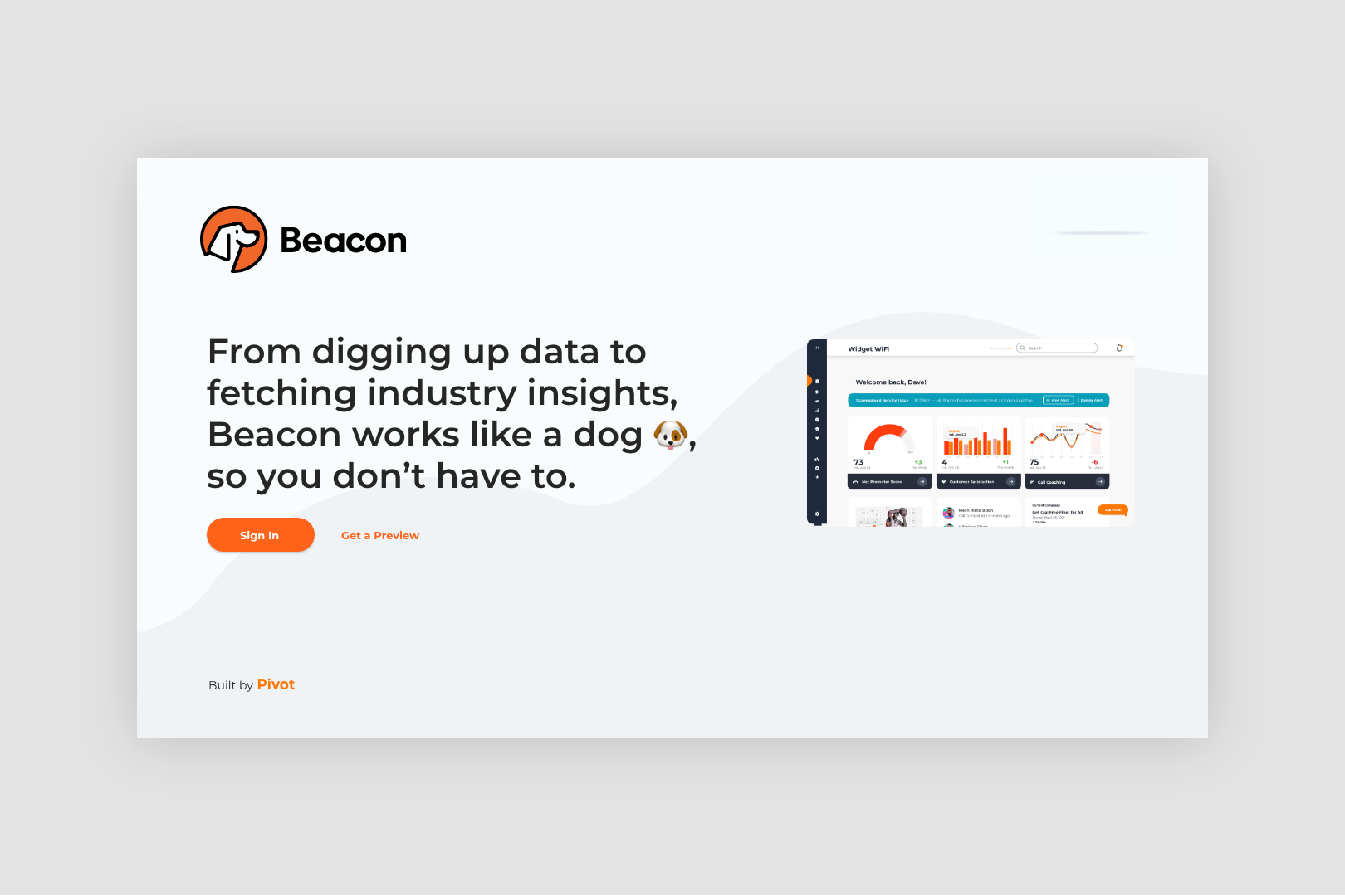
On beacon dashboard, text and iconography makes the variety of ways one can sign in and sign up clear to users within an instant.
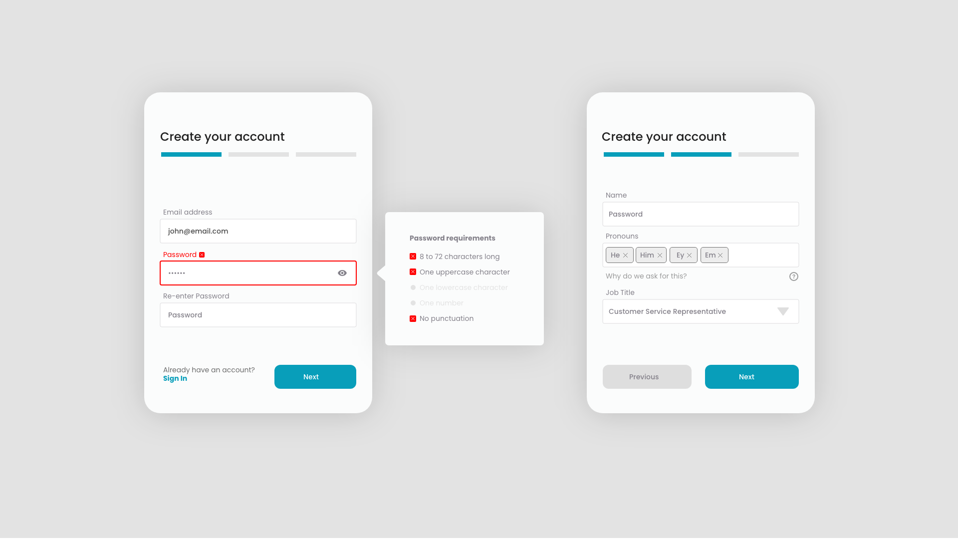
Added support
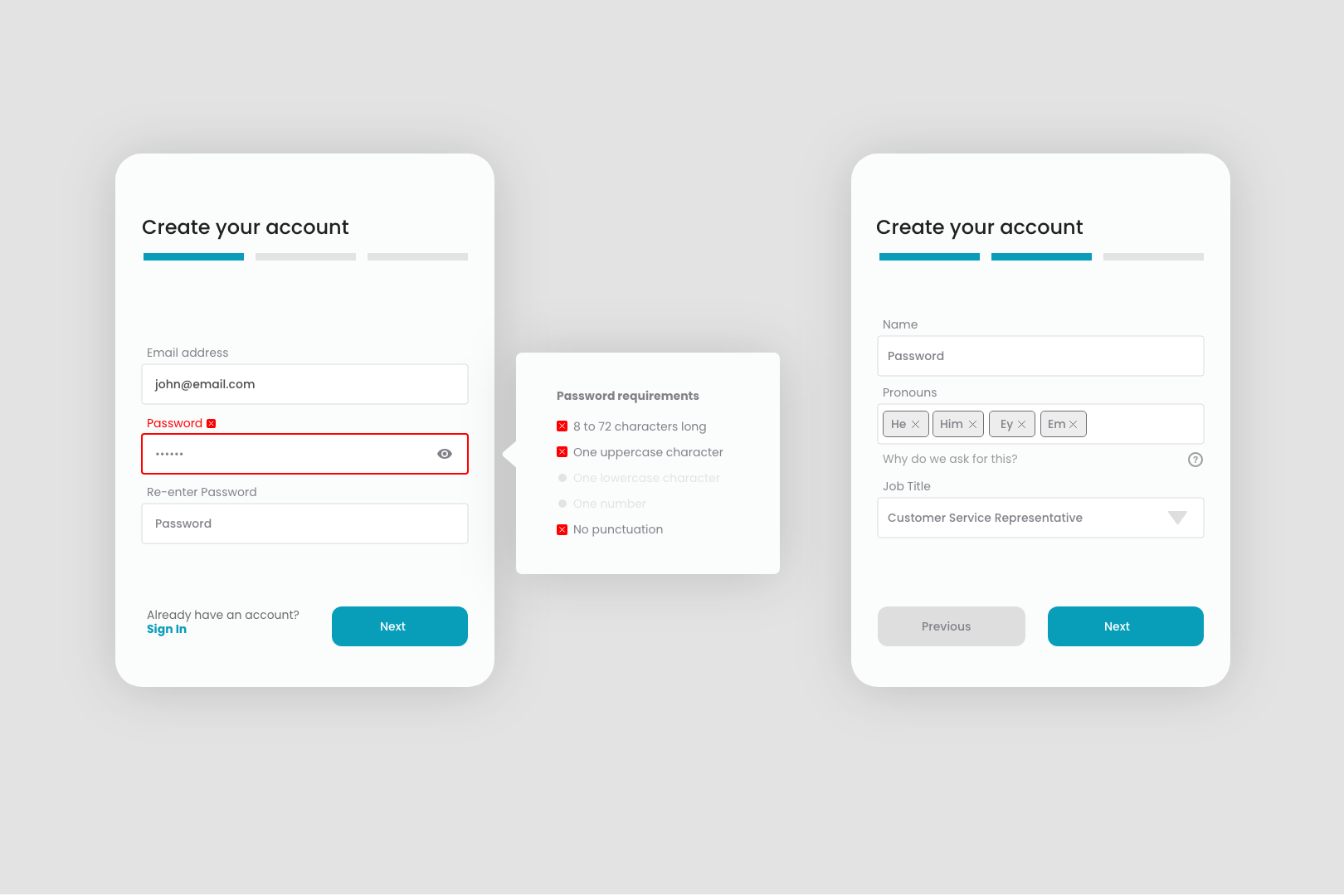
The only thing worse than filling out a form is the encountering an error while filling a form in. Helpful in-context messages provide clarity around requirements and also provide opportunity explain the purpose of different requests.
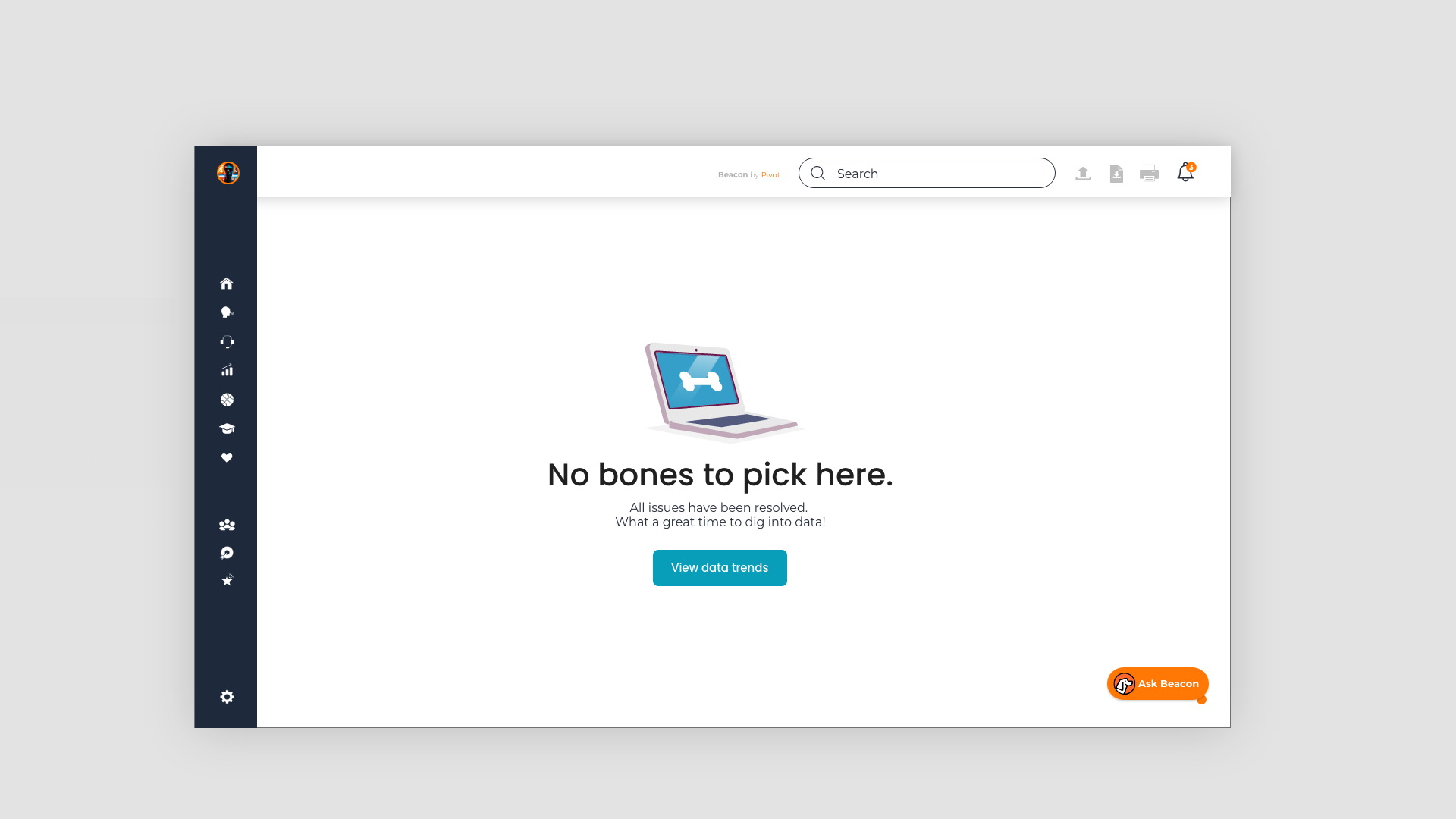
Avoid a blank page
Nothing feels more broken than a blank page. This empty state for the Beacon Dashboard not only assures users that everything is going according to plan, it also invites them to use additional site features.
Tiny acts of kindness
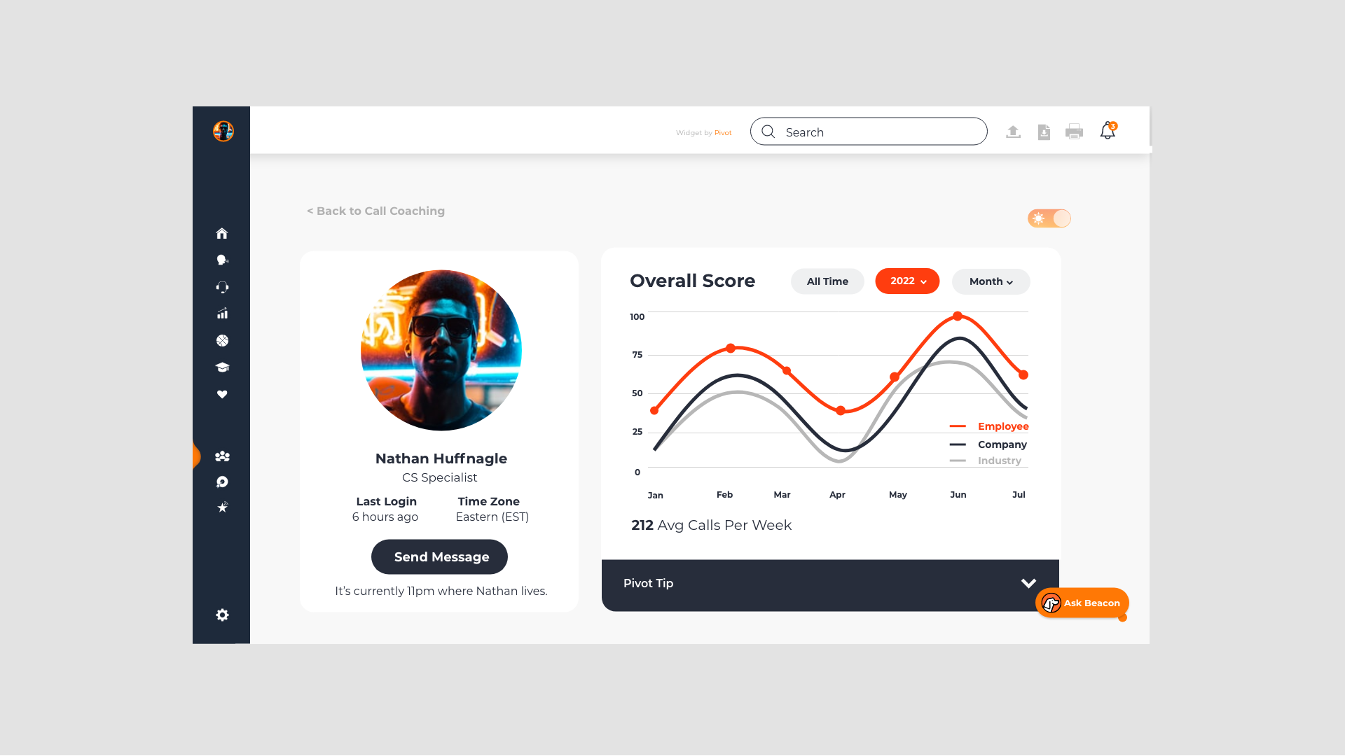
Beacon dashboard users live in a range of time zones and often message one another. A subtle note under the send message option on a user profile page reminds them of the time it is for the message recipient.
Teach in the moment
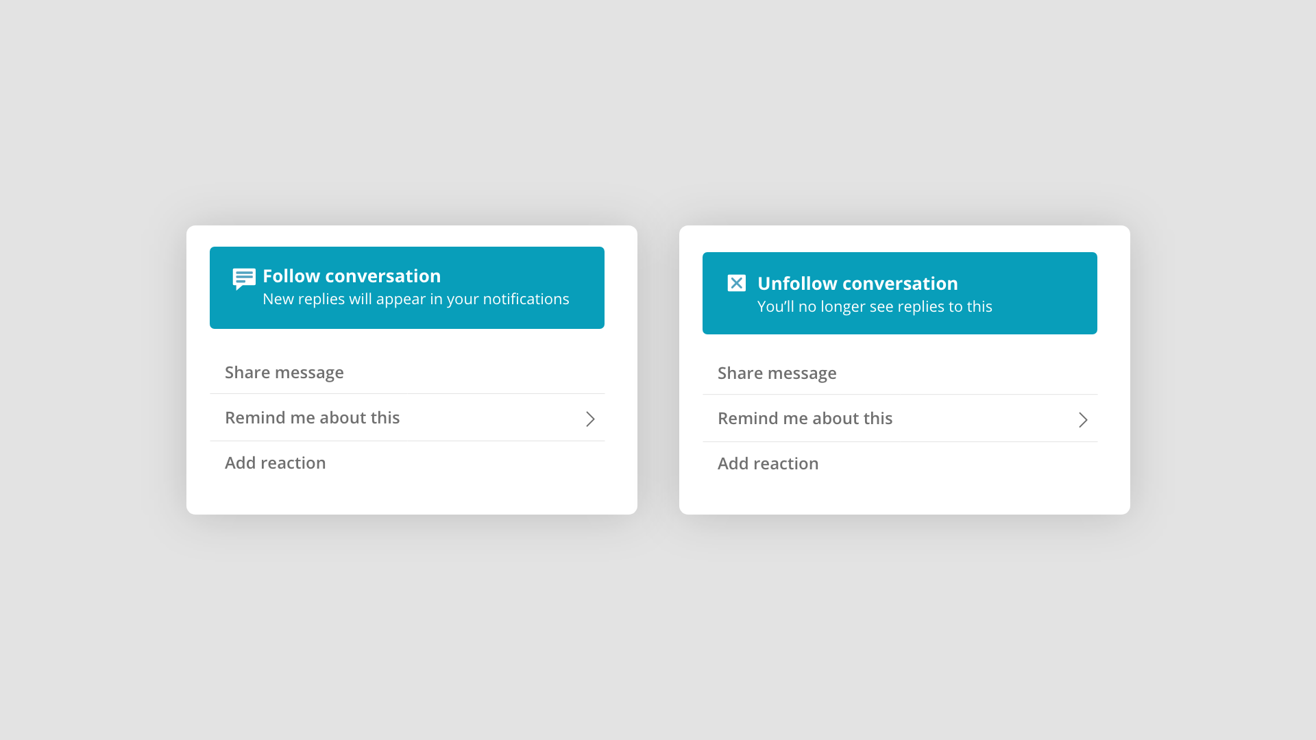
User research consistently demonstrates that in-context education is stickier than traditional onboarding. I snuck this explanation inside a button—teaching users the meaning of the button at the moment they chose to take action.
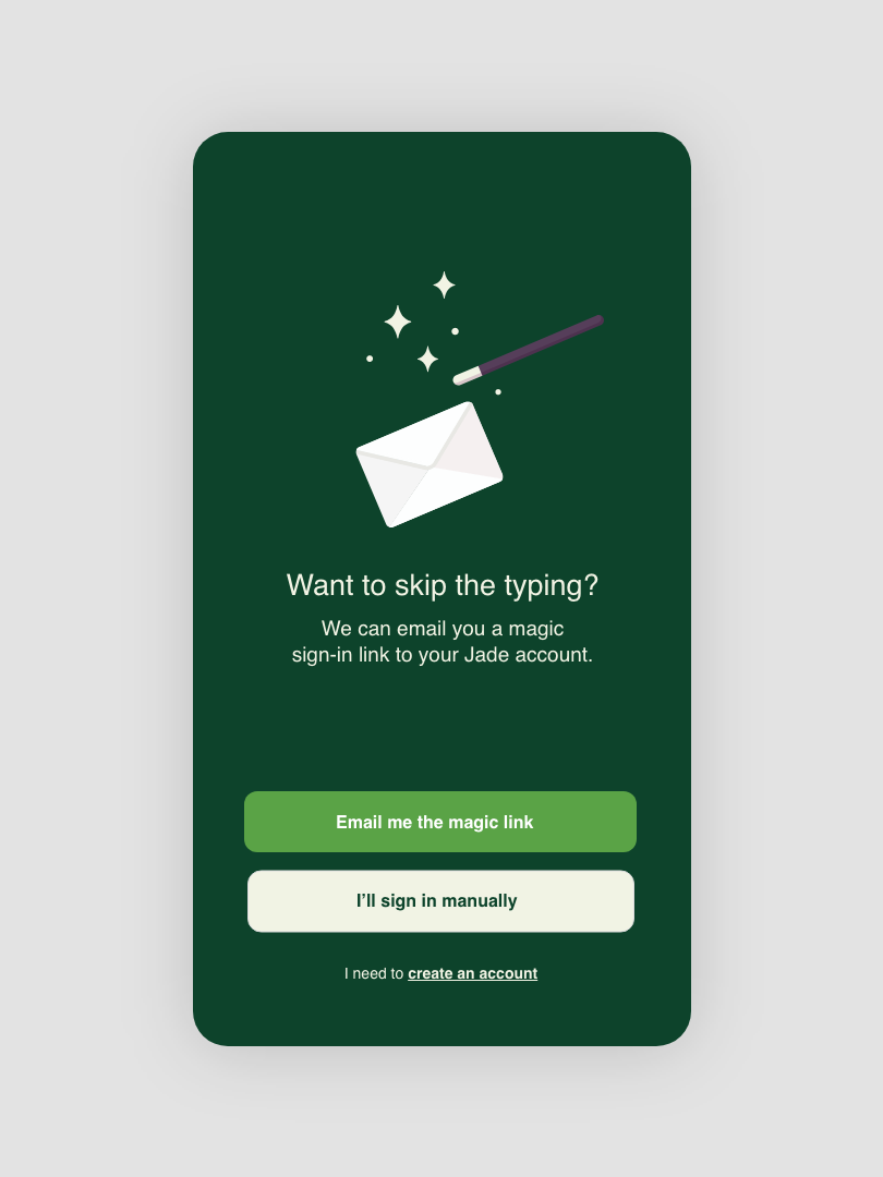
Easy login
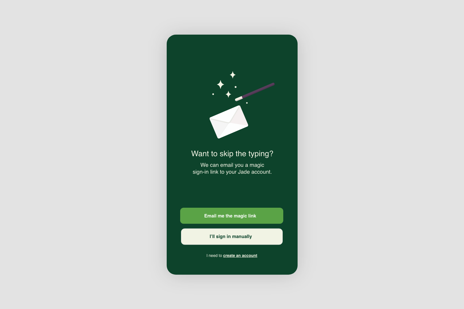
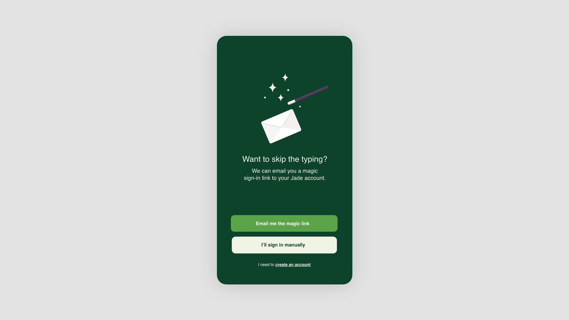
Most people have too many passwords to keep track of, so a user-friendly login screen is incredibly important.
Lead to the detail
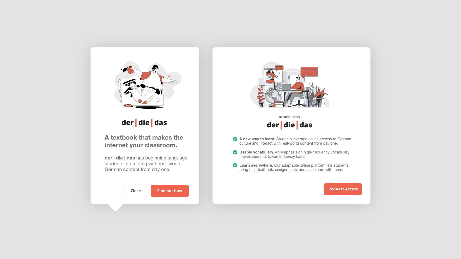
Introductions are tricky, and its tempting to overcommunicate. In this in-app promotional messaging for der | die | das we lead with the goals that language learning faculty often have and the benefit the online learning platform brings to them. This approach sparked curiosity and earned the opportunity to go into more detail later on.
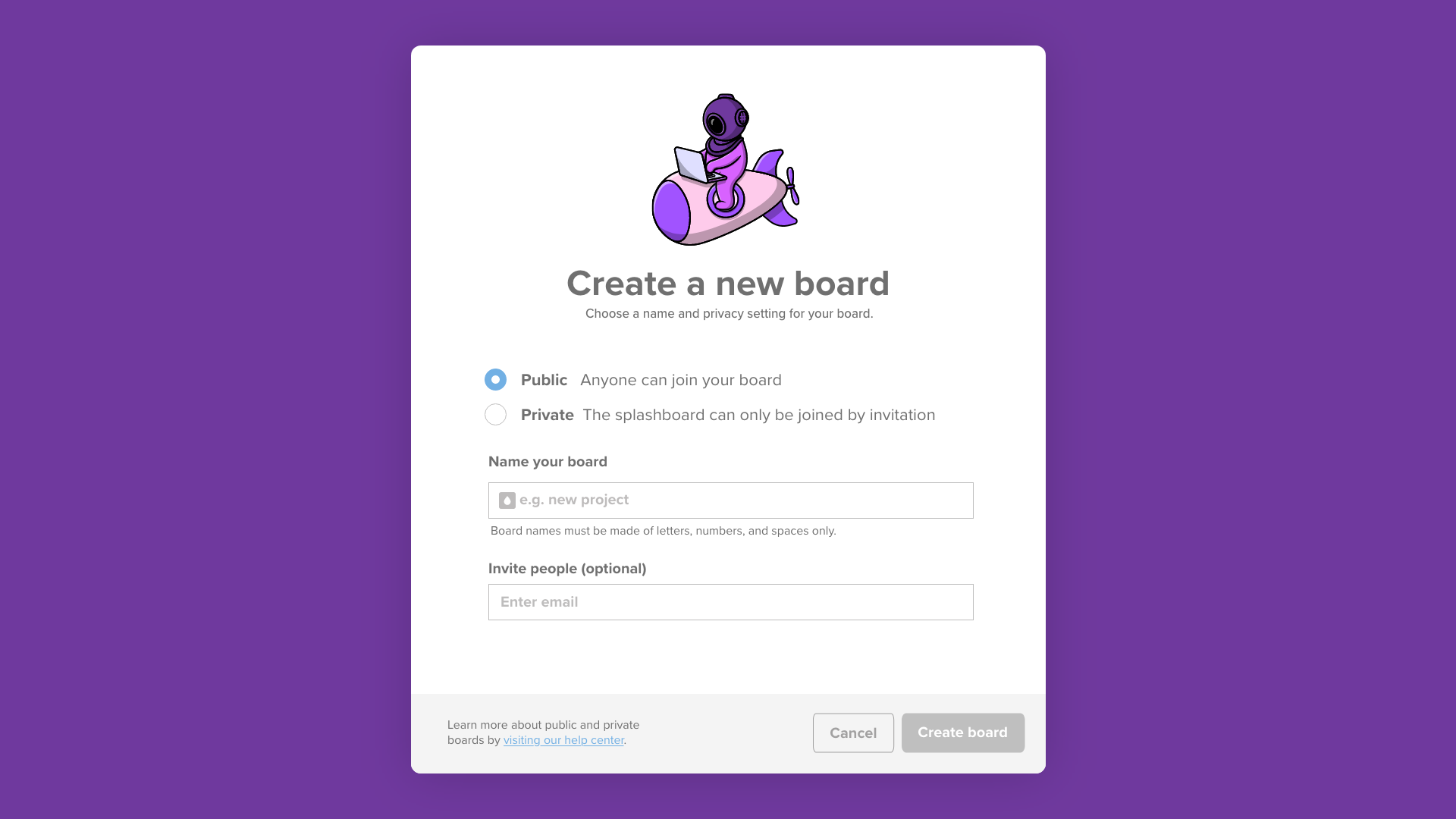
One-screen setup
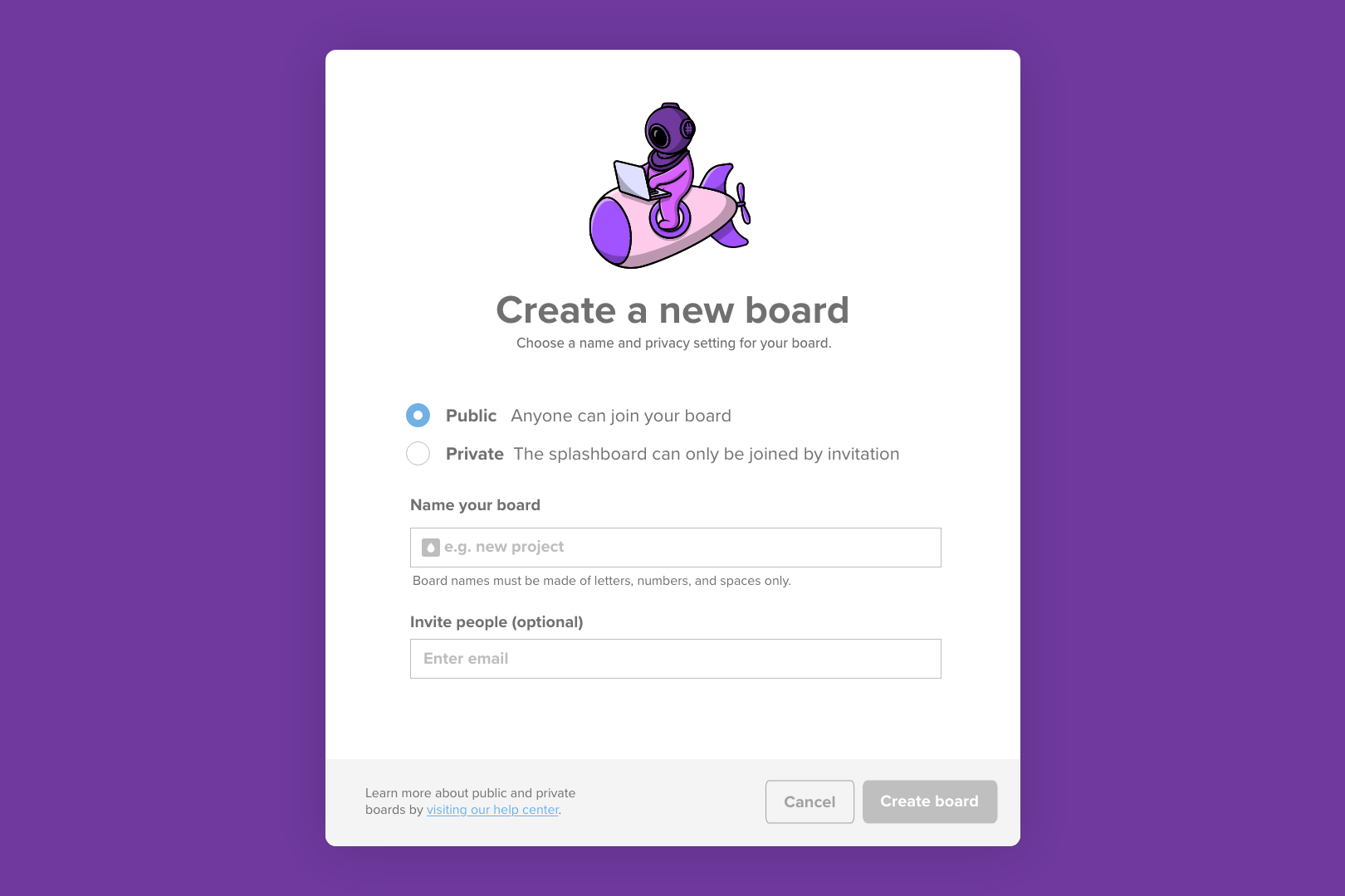
This one-screen, collaborative “splashboard” setup looks simple enough — but getting there took lots of work. After whittling down requests from stakeholders, we were left with just the essentials.

