Princeton University
Language learning doesn't need to be so difficult.
Background
Changing the way we learn languages through innovative curriculum and accessible UI design.
Over the course of five years, I partnered with faculty and staff at Princeton University in the development, design, and branding of several online textbooks. The first and most significant of these being der | die | das — a German language learning platform used in curriculum for over 13 Ivy League Schools including Princeton, Harvard, and MIT. What started as a singular project lead to subsequent work developing language sites for the Spanish, Italian, and English departments as well as branding for the newly founded Princeton Center for Language Study.
Scope
Branding
UI/UX Design
Front-End Coding
Javascript
Naming
Collaborators
Jamie Rankin, Content and Vision
Ben Johnston, CMS Development and Content Adaptation
Adam Gallagher, Backend Coding and Custom CMS
German · Spanish · Italian · English ·
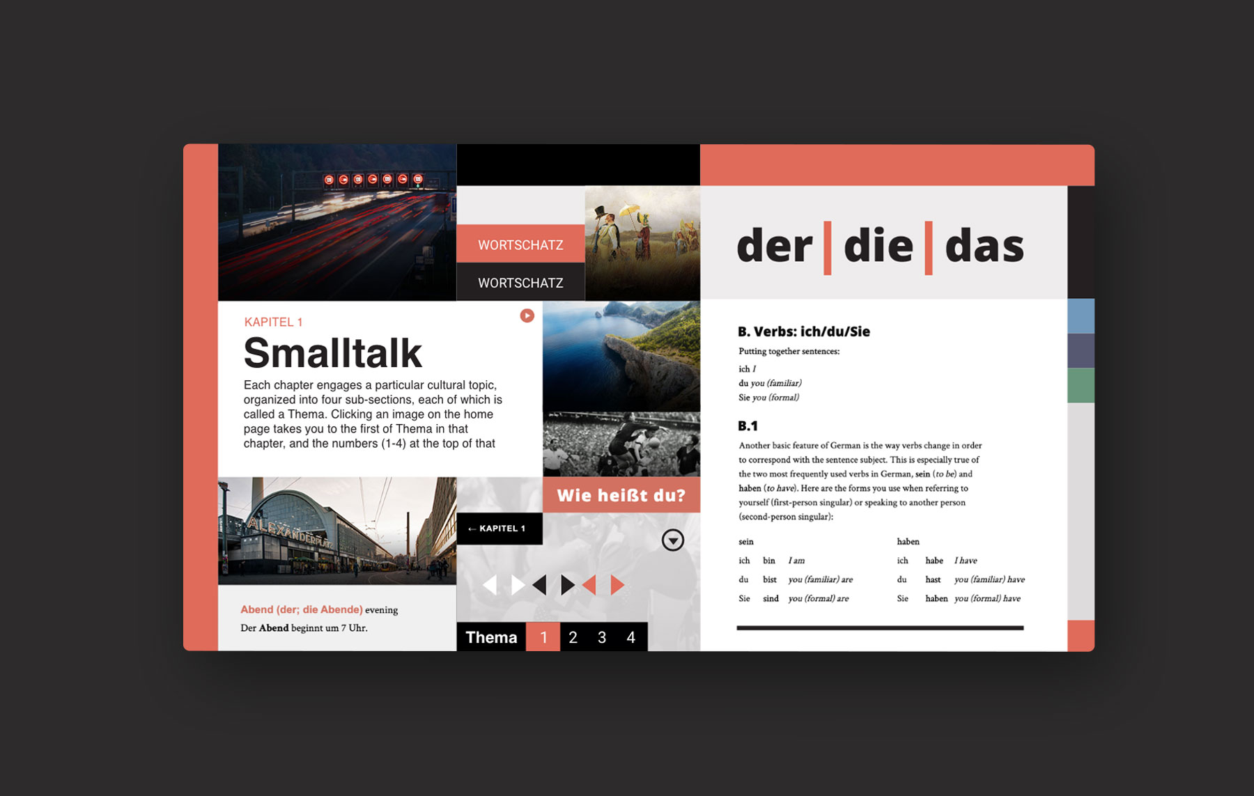
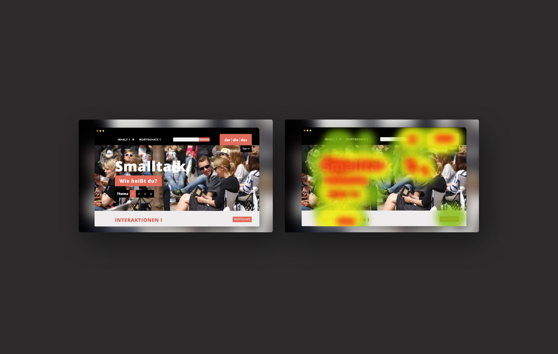
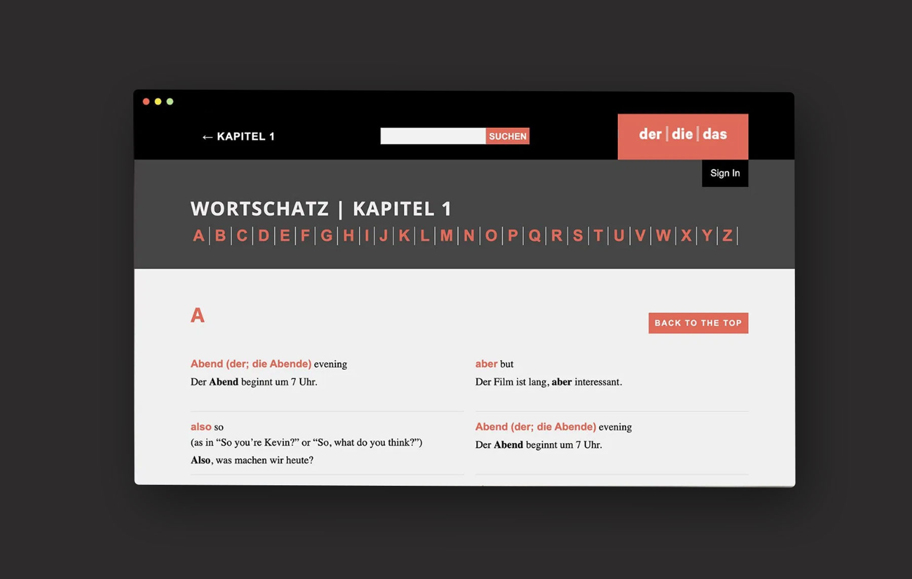
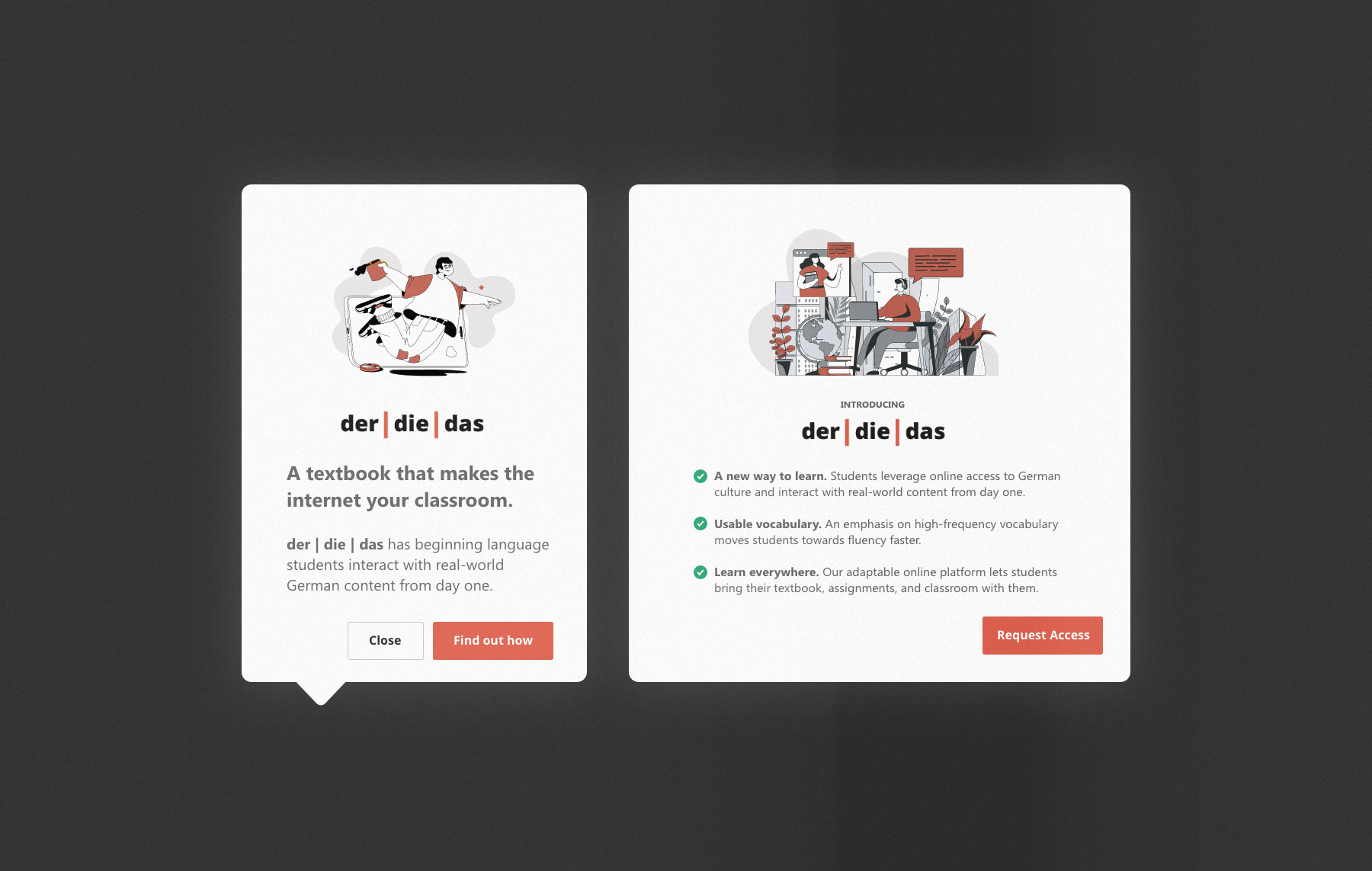
der | die | das
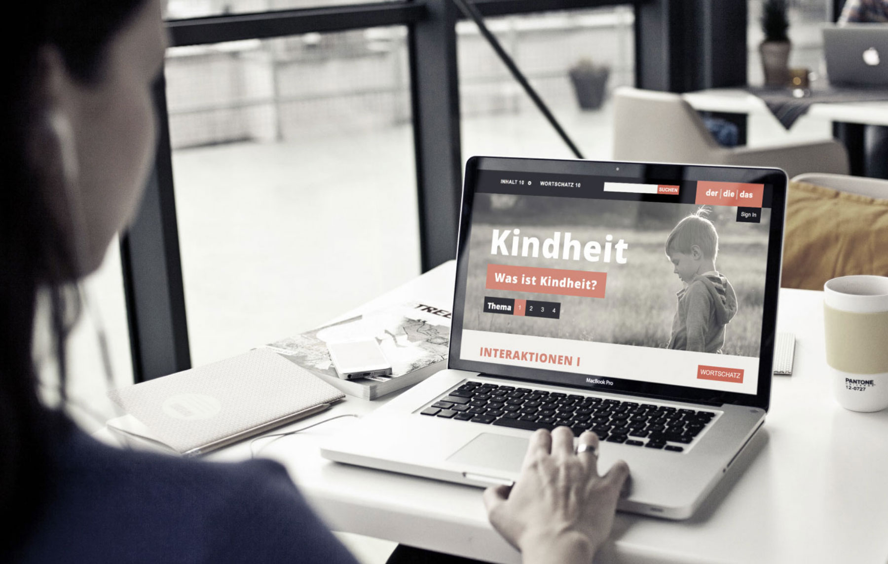
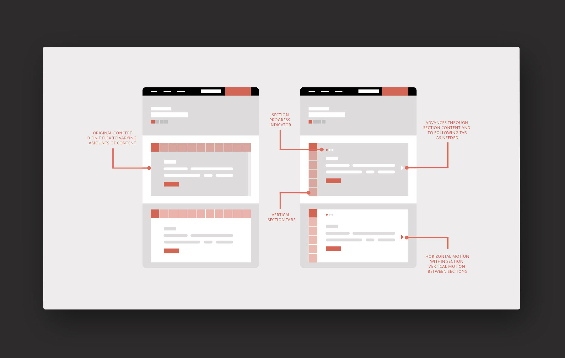
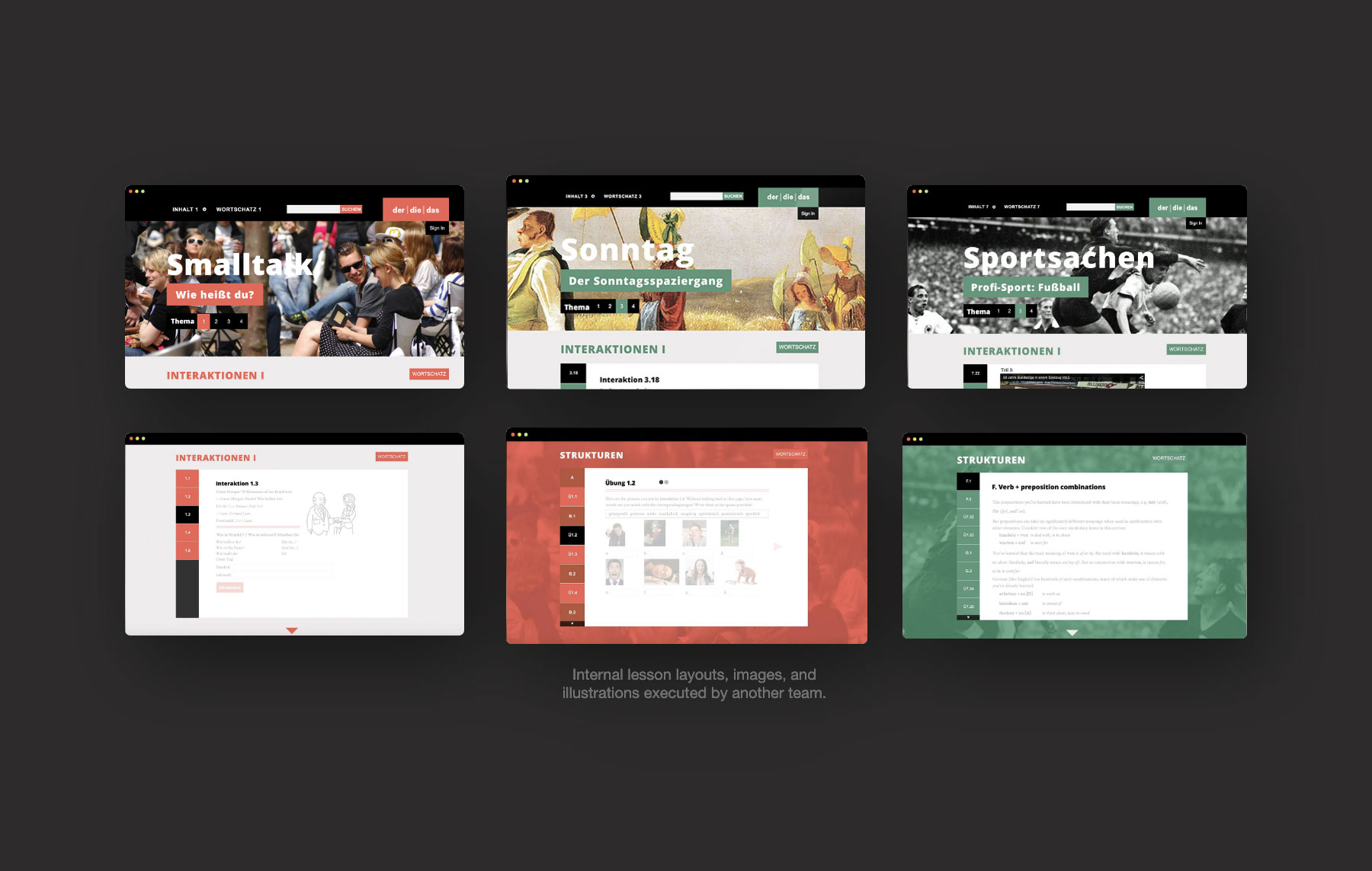
der | die | das — three terms for “the” in the German language and the entry point into this innovative learning curricullum and platform. der | die | das is a website that serves as a living textbook, learning management tool, and journal for students working through German language study that was first launched at Princeton University and has since spread through Ivy League institutions and tier 1 language learning programs throughout the country.
Challenge
Anyone who has opened up Duolingo knows how frustrating language learning can be. People spend hours upon trying to learn terminology, construct sentences, and conjugate verbs only to have their language study steadily fade due to disuse. The process grows even more frustrating when the language study is filled with terms one will rarely ever use or are more helpful for simple experiences like ordering food or getting directions than reading a story or holding a conversation.
Insight
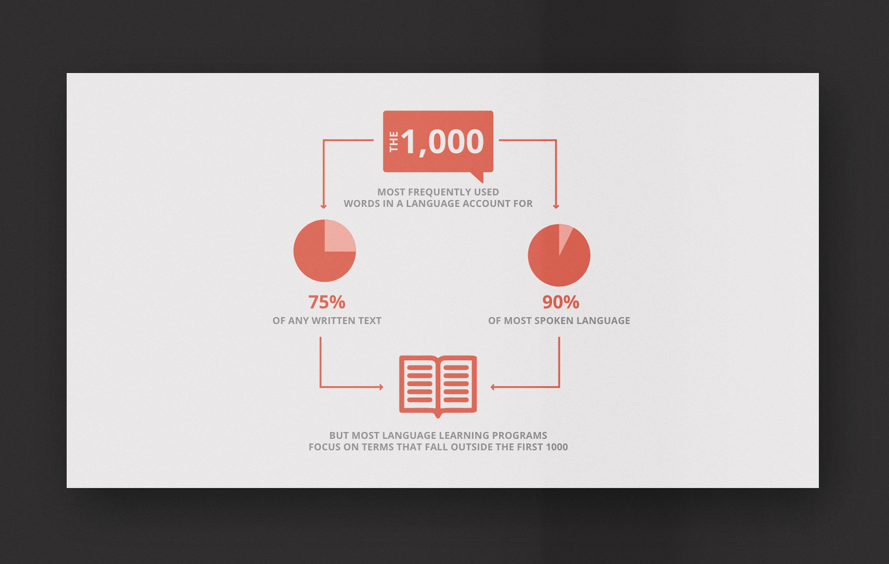
The 1,000 most frequently used terms in a language account for up to 75% of almost any text. Yet the most frequently used textbooks incorporate significant quantities of words that fall far outside these common use terms. This leaves students with vocabulary they are unable to apply in real life.
Approach
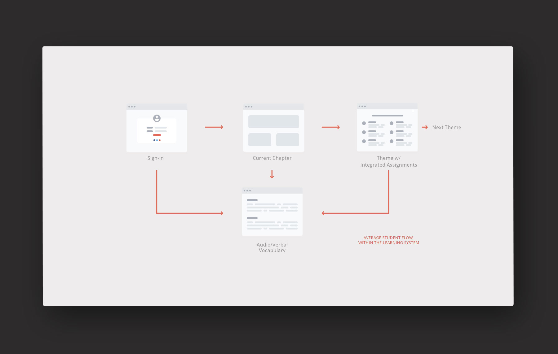
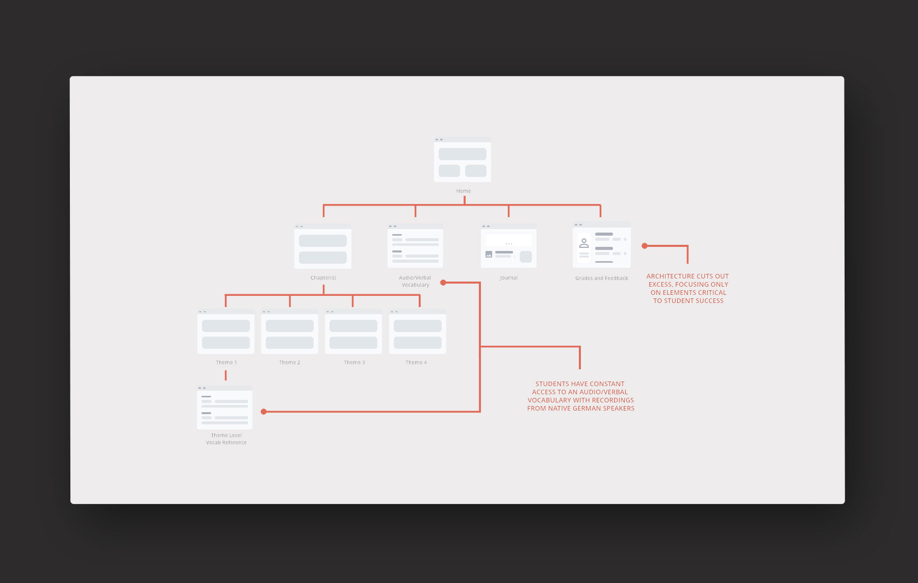
The use of common terminology and an online platform led to learning experiences that encouraged students to practice their language work by visiting German sites, watching German videos, and listening to recordings from native speakers.
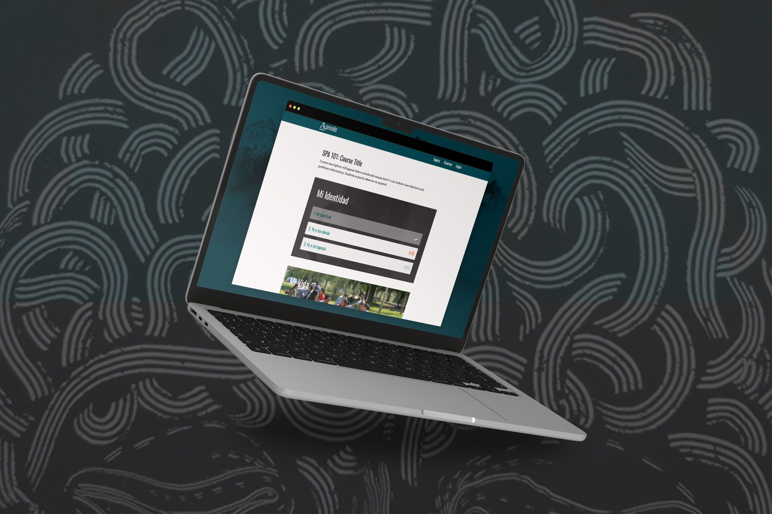
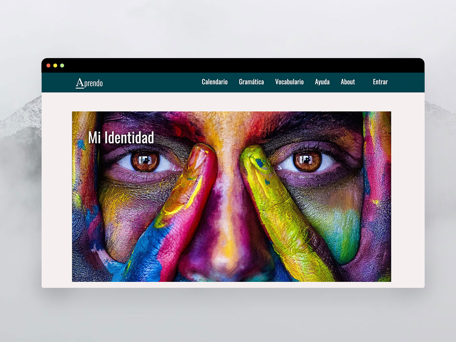
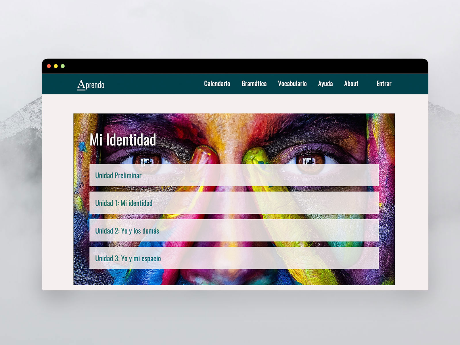
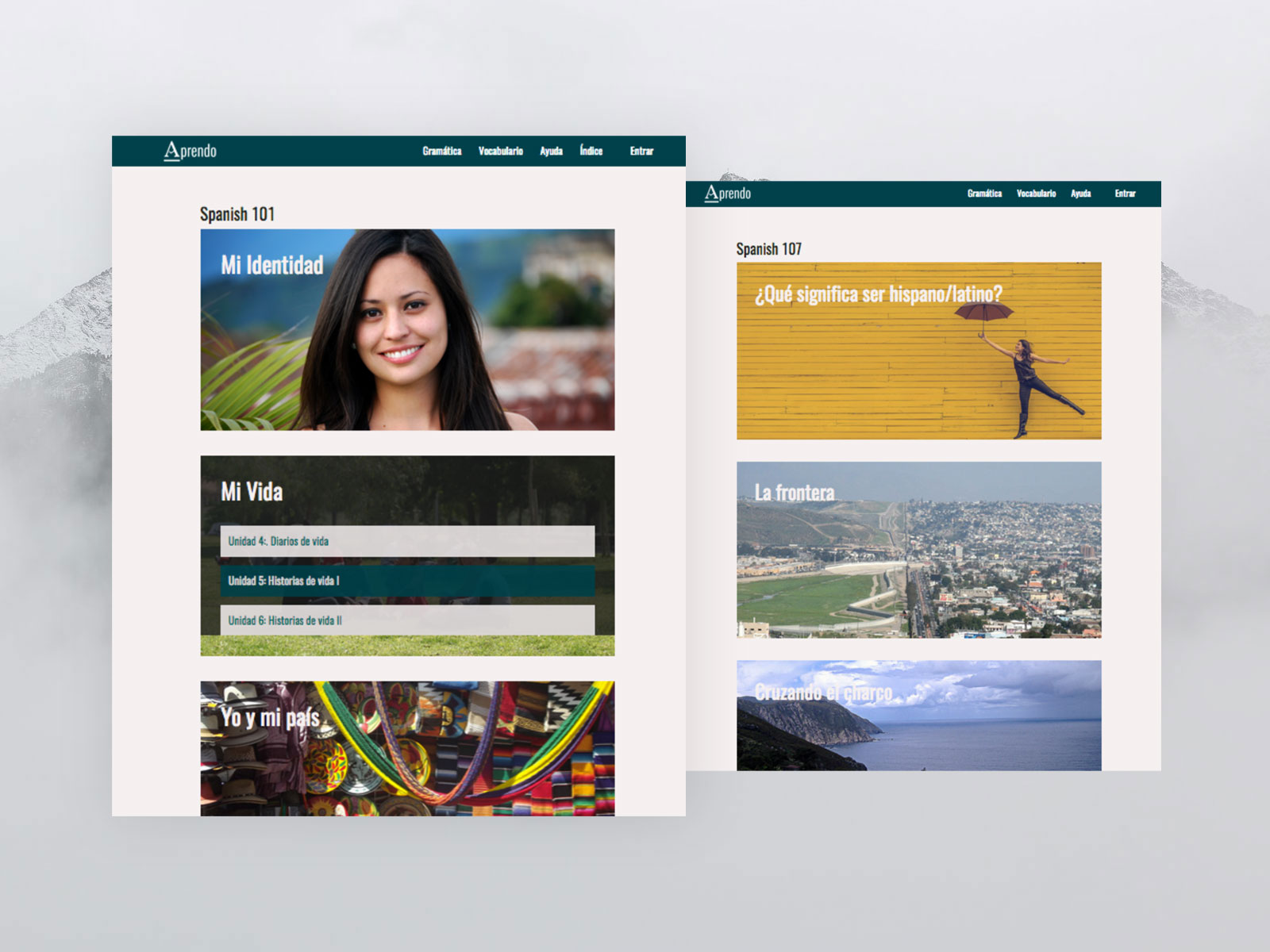
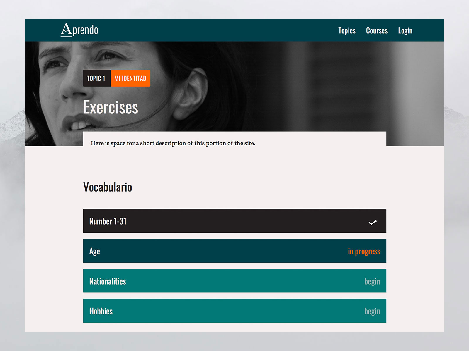
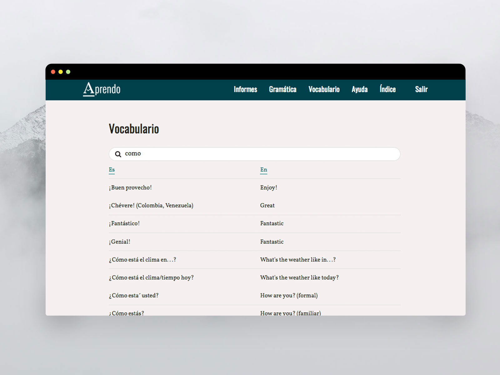
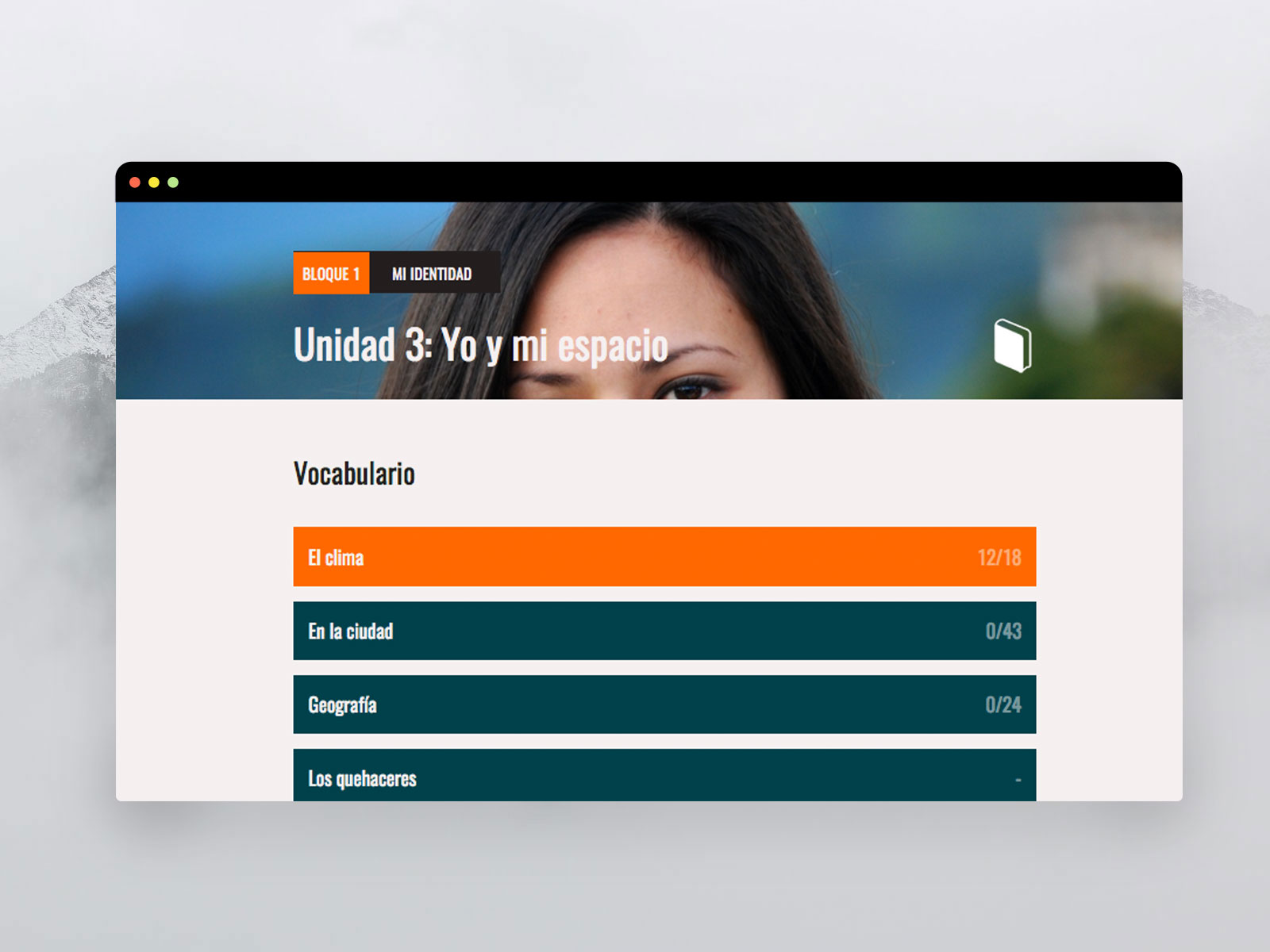
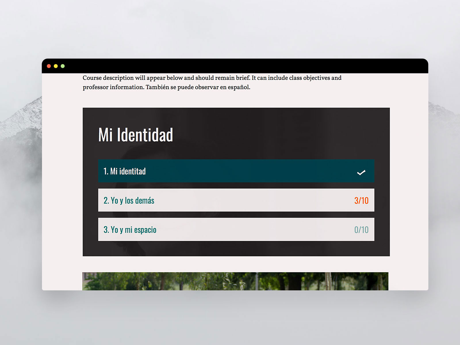
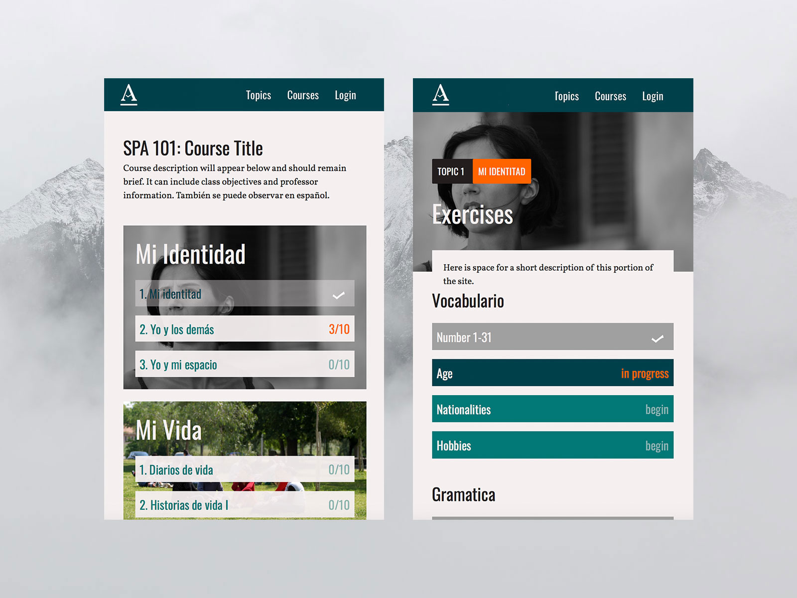
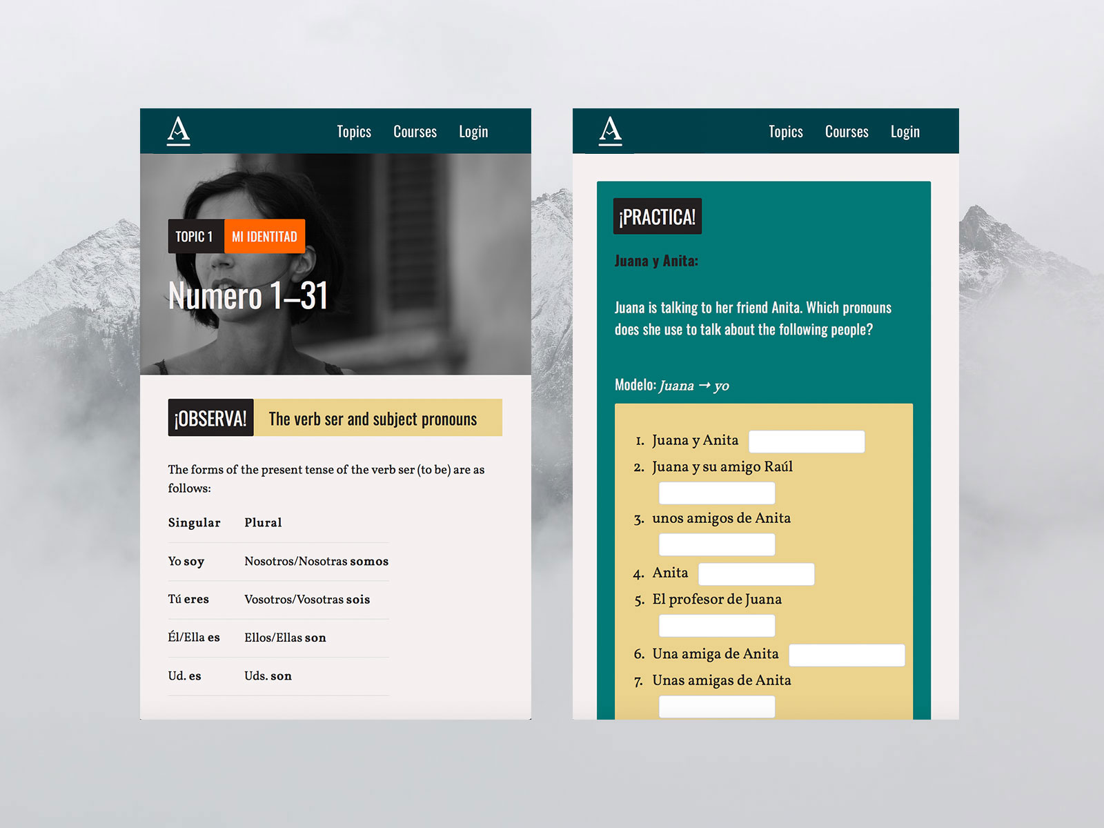
Aprendo
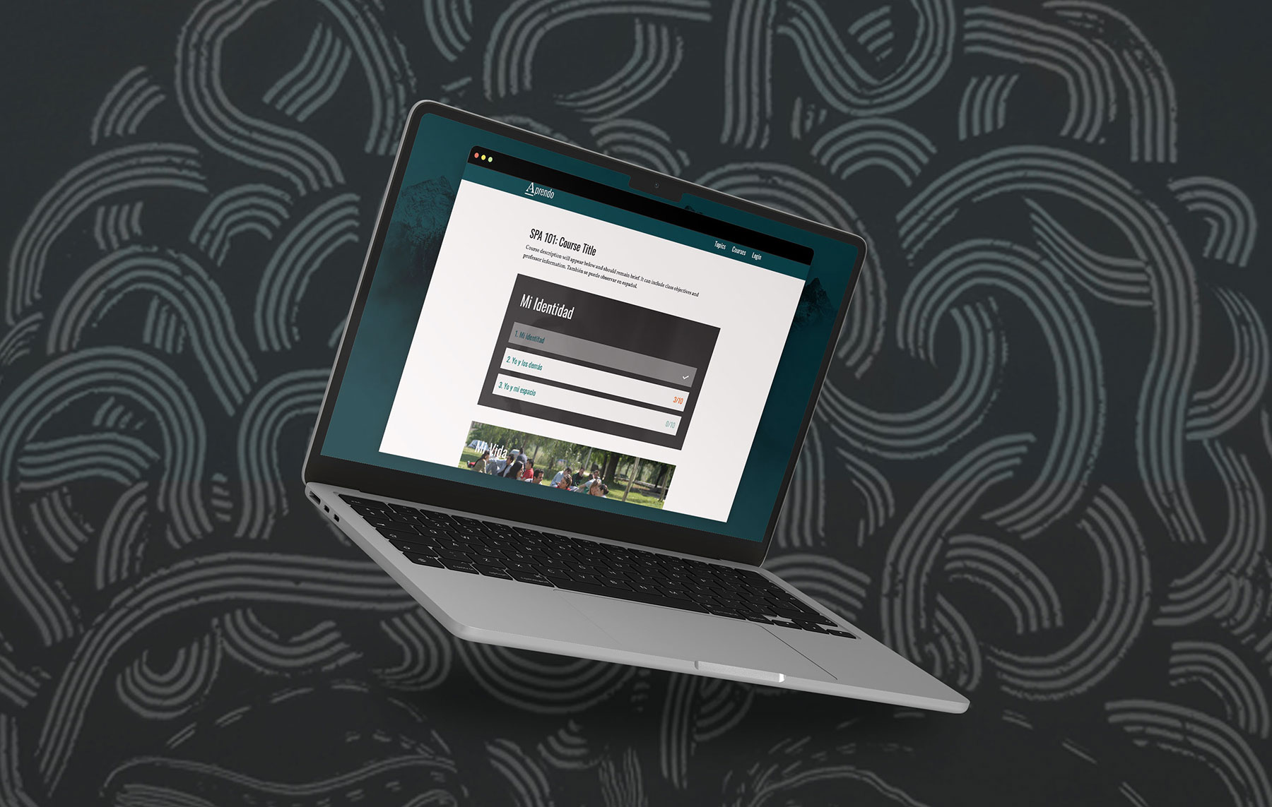
Shortly after launch of the der | die | das platform, Princeton’s Spanish department was looking to develop its own learning platform. The Spanish programs at Princeton use readings and materials pulled from a variety of countries of study. Rather than creating a custom textbook, they were in search of a way to easily organize content for their students, build online exercises in response to their work, and offer feedback all in a culturally-relevant hub. I worked with Ben Johnston and the faculty to name, brand and design the core platform for their learning management system.
The Logo
Aprendo’s central element is a custom letter A, based on historic Spanish Signage. The letter incorporates a subtle nod to the shape of a pencil and the pages of book, reflecting the nature of the site as both a digital textbook and activity center for students.

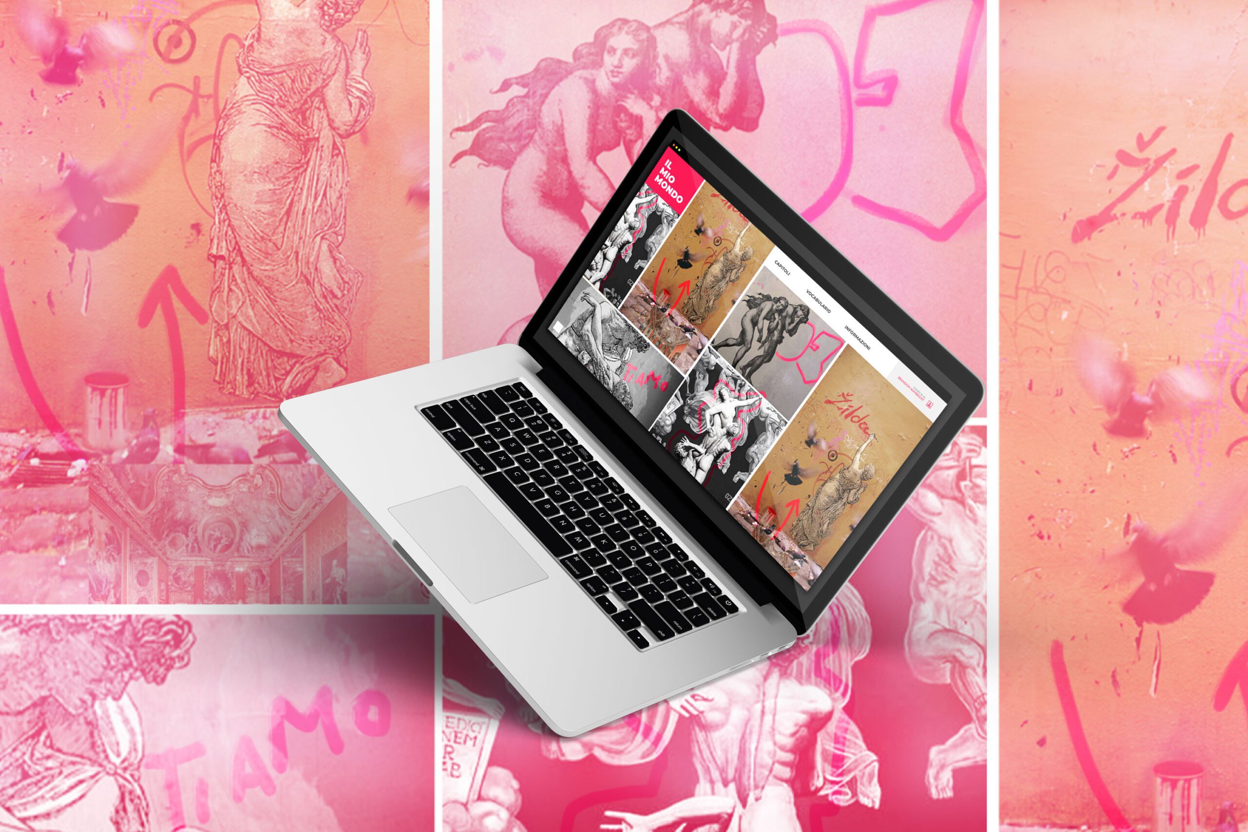
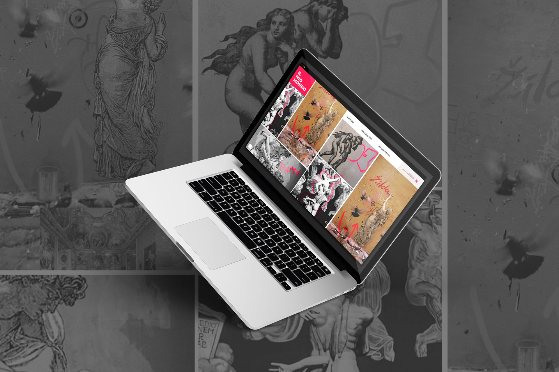
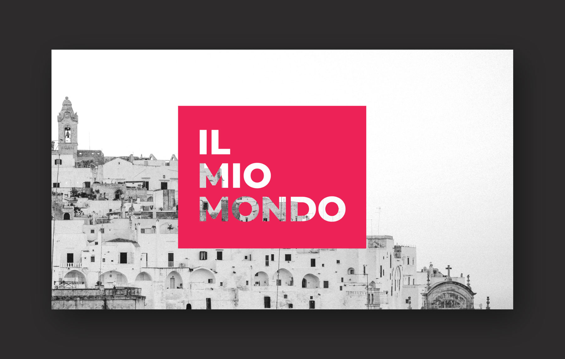
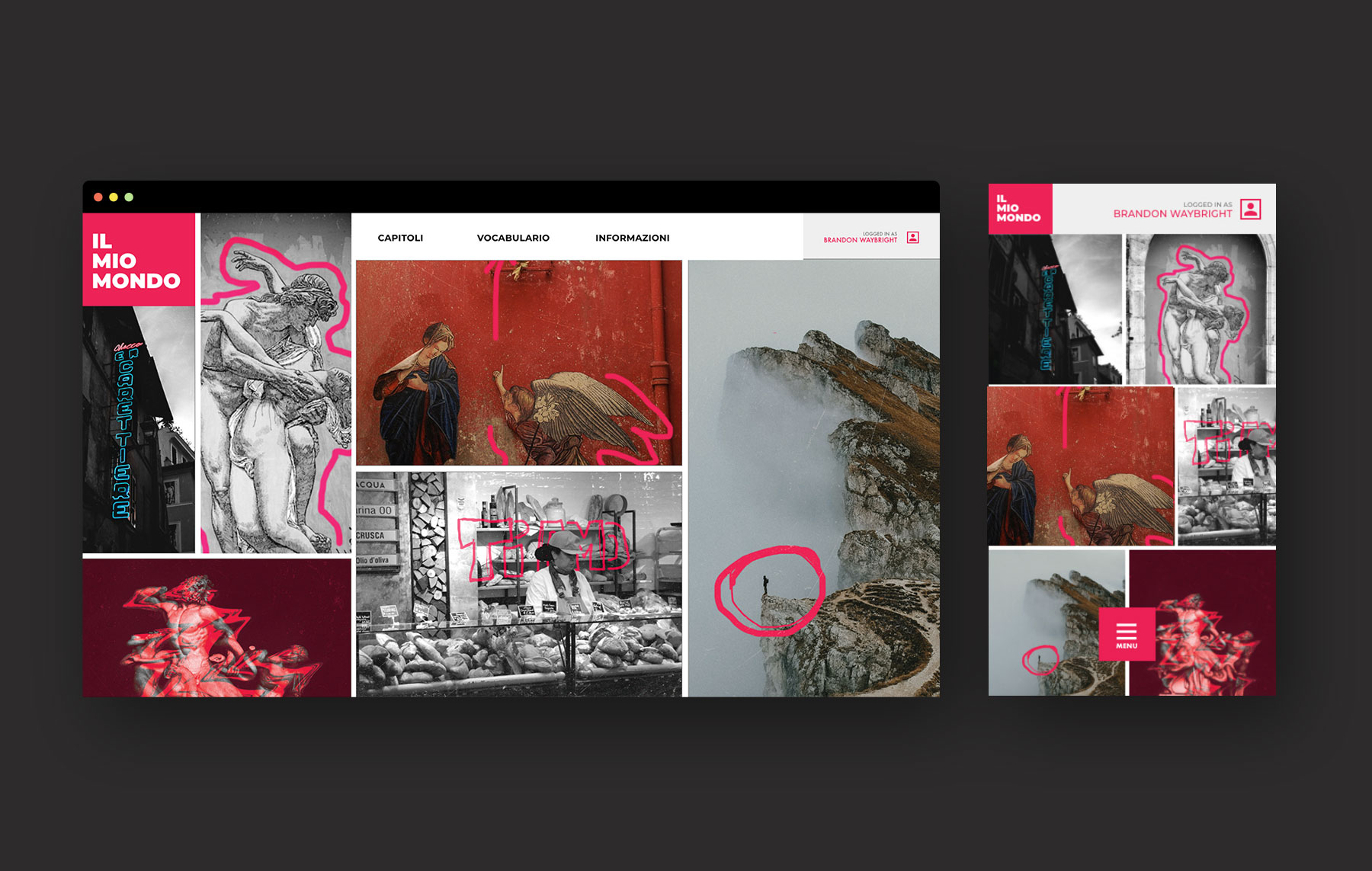
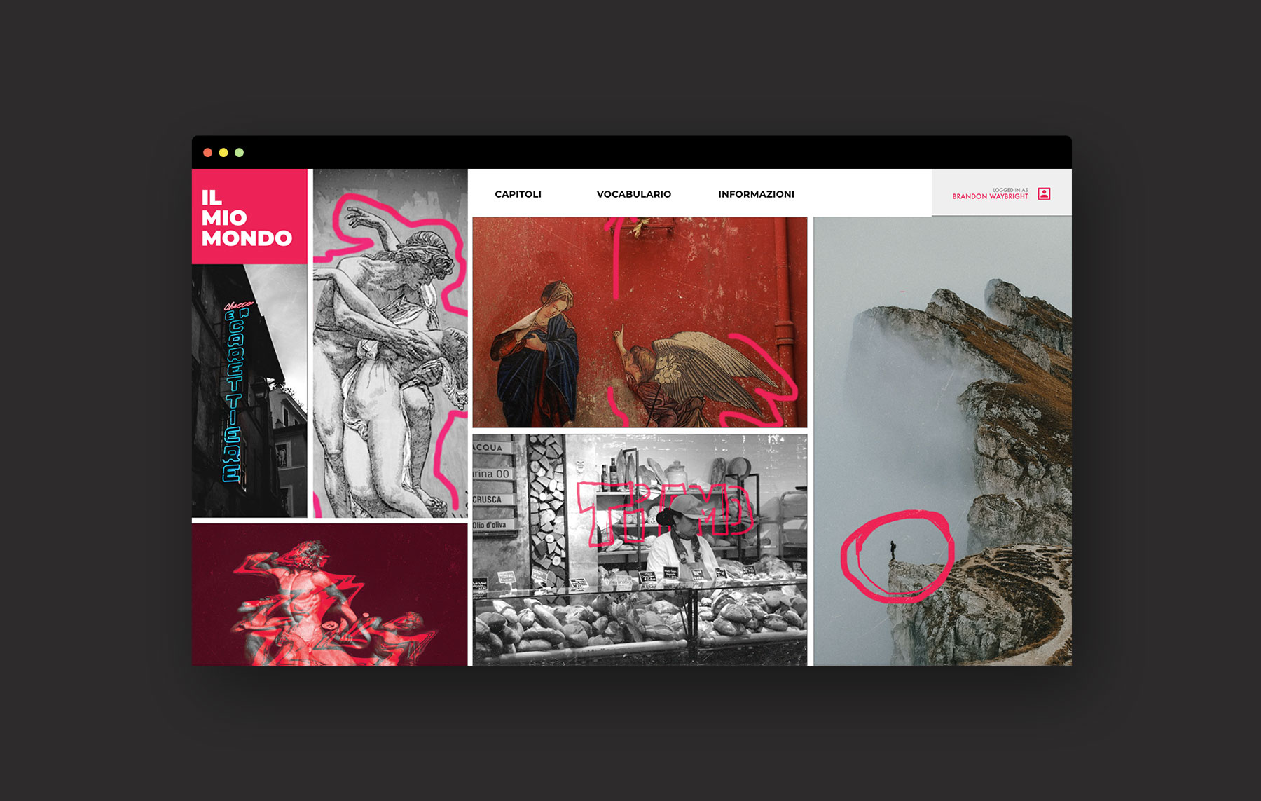
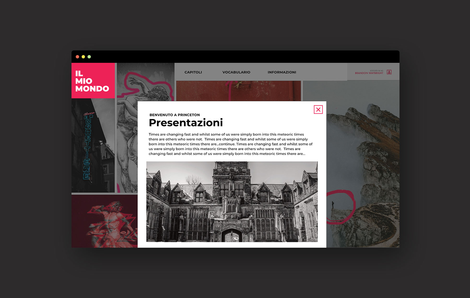
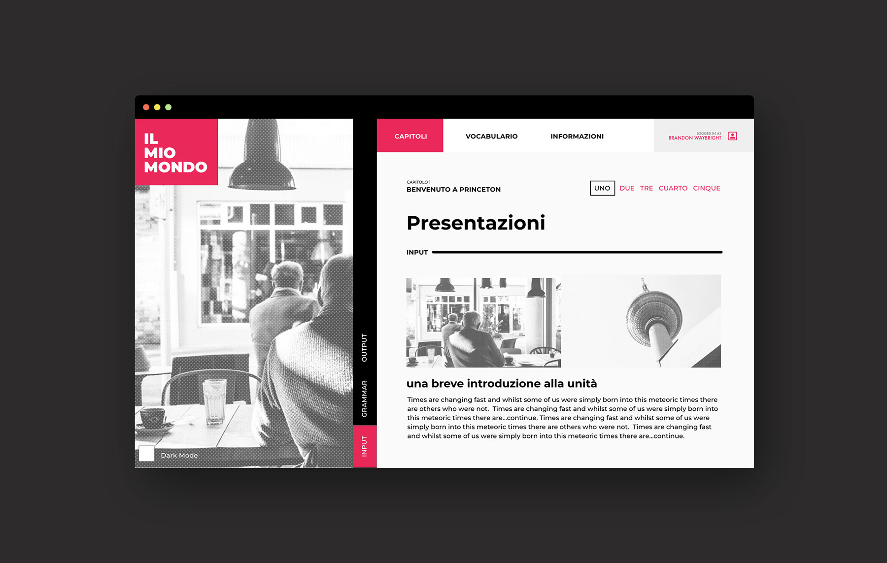
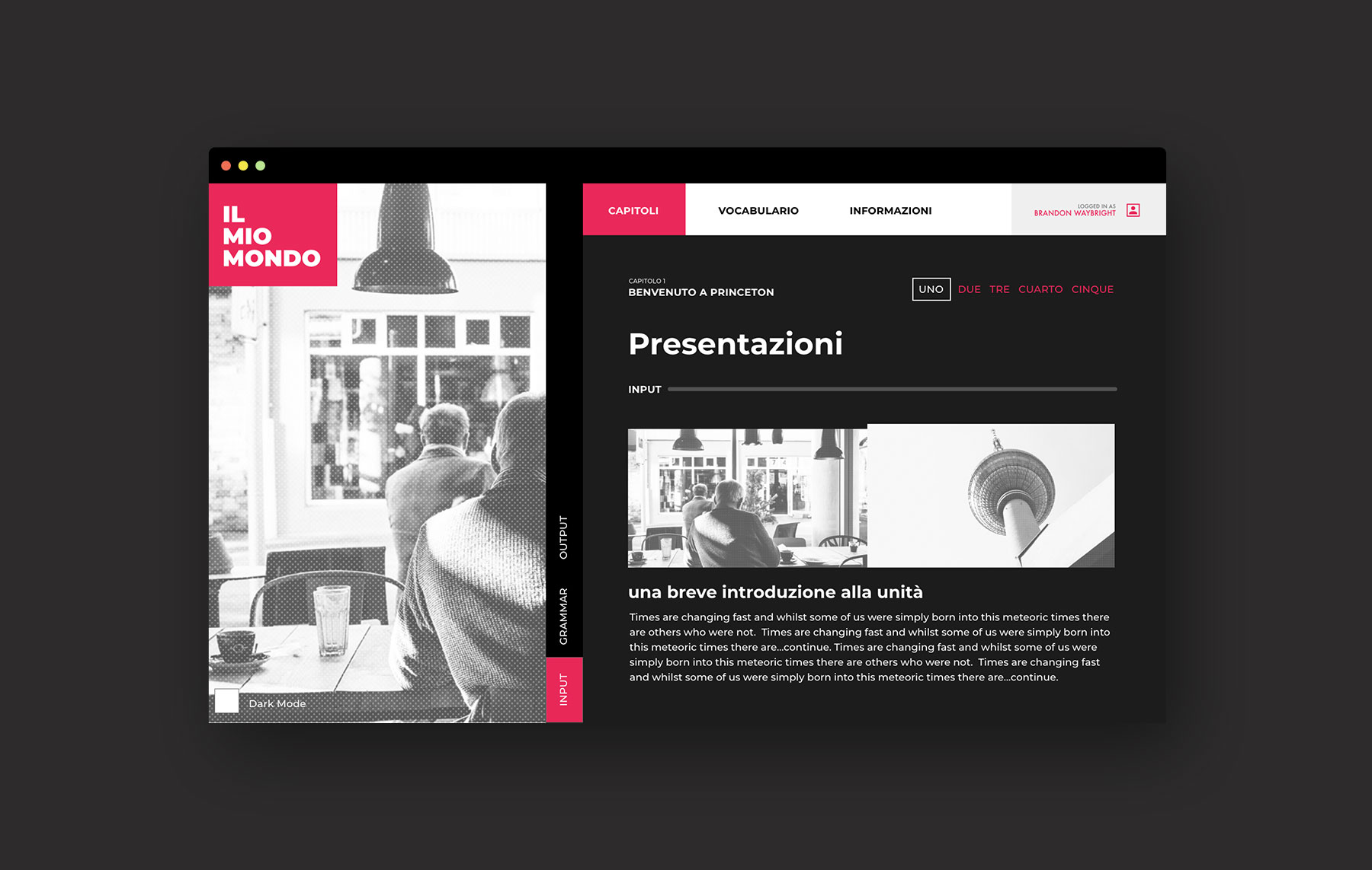
Il Mio Mondo
Unlike more utilitarian languages that might be studied for business or purely academic purposes, people choose to study Italian out of love for Italian culture and history. Because of this, Princeton’s Italian department was looking for a learning management system that would visually immerse its students in the visual, experiential culture of Italy.
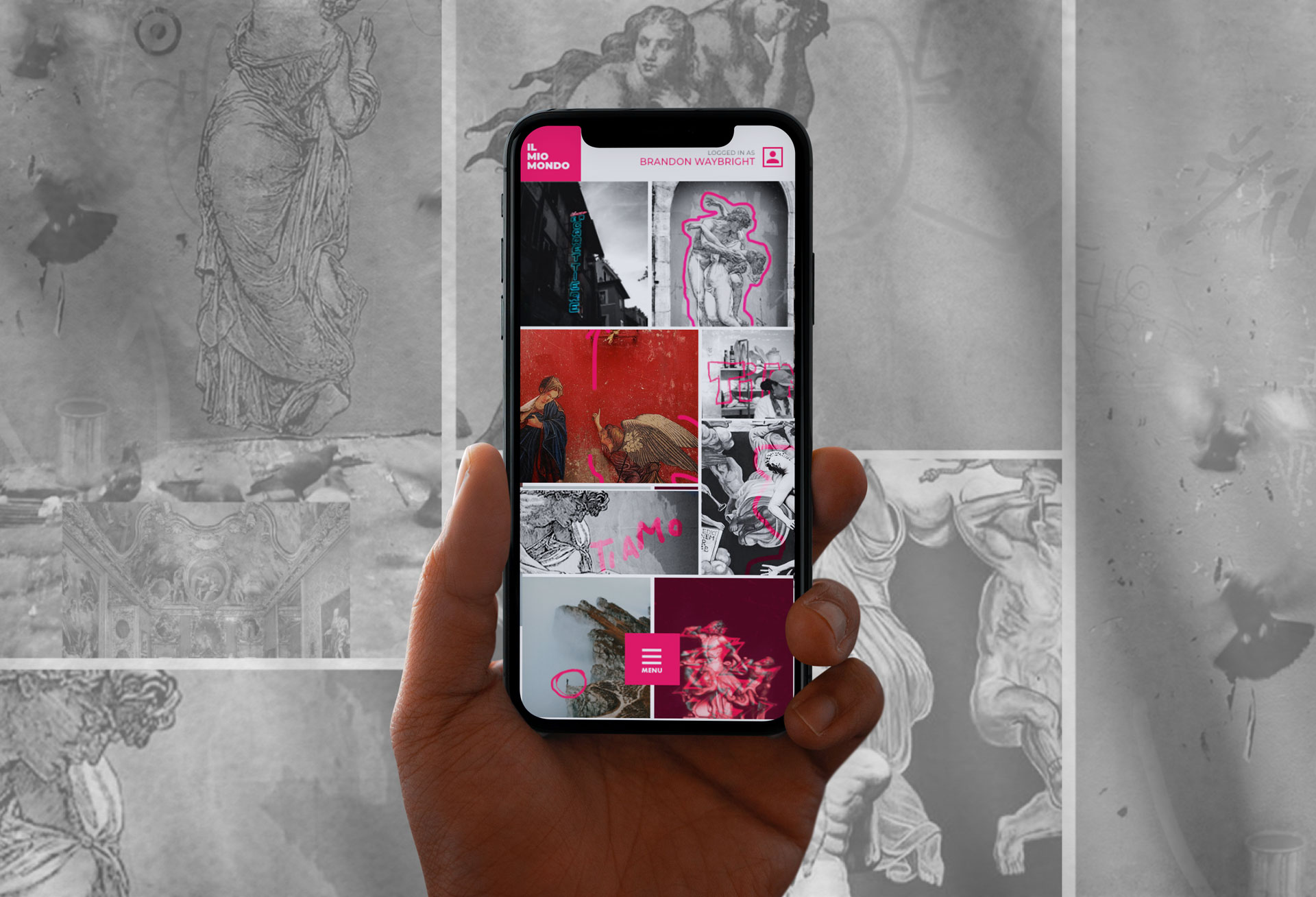
Love Italy
Where the German site focused on structure and the Spanish site focused on representing cultural variations, the Italian site was primarily made to spark curiosity and inspire people to explore Italian culture. The home page in particular was crafted to encourage students to uncover surprising cultural insights by interacting with different images and buttons on the site.
Improved learning outcomes.
“As we started reading longer texts, I found that I was able to read these examples of actual German prose—regardless of which genre they came from—with increasing ease and retention. Even during the fall semester, I found that I was able to read articles from Der Spiegel, Die Süddeutsche Zeitung, or other major German newspapers without having to consult the dictionary for every sentence.”
—Student Feedback, der | die | das